

 Have a look at the figure on the left. It shows the number of visits to this site broken down in hours of the day -the time of the server used by the visitor. The statistics of each bar is sufficient that the uncertainty on their height is of the order of 2%, so almost indistinguishable by eye. What you can see, therefore, are real variations with time of the traffic to this site, and not random fluctuations up and down.
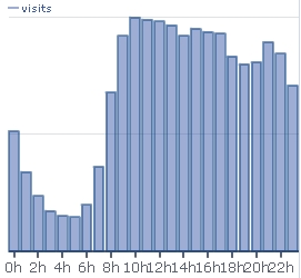
You immediately note the night dip: people stop reading this blog after midnight, and resume after 8AM. Also note its asymmetric nature: the decrease is exponential, with a "hardcore" bottom of sleepless visitors; while the increase after 6AM shows a typical turn-on shape, the one you get if you integrate a Gaussian shape. It reflects the higher and higher active users as the morning progresses, when the time of start of their operations has a Gaussian shape.
But there is much more to note. For instance, the dip at 2PM: it is significant, and evidences the lunch break that some take at around that time. Even more significant is the fall after 5PM, which is due to people leaving office and eventually having dinner. Activities increase again after 9PM, to then drop as night falls.
I think this graph -or similar ones one might draw with large-traffic sites not connected to business- carries some sociological implications. It clearly demonstrates that people spend their working hours on the internet, more than their ours off work. It also gives an idea of the fraction of night browsers, which is larger than I thought. Finally, but this is a less-well founded hypothesis, the decrease of visits from 10AM to 5PM evidences our diminishing attention span as the day progresses.
Do you have similar plots to compare ? I bet there are internet sites which devote a lot of attention to these issues. If you have a good link to share, let me know.


Comments