

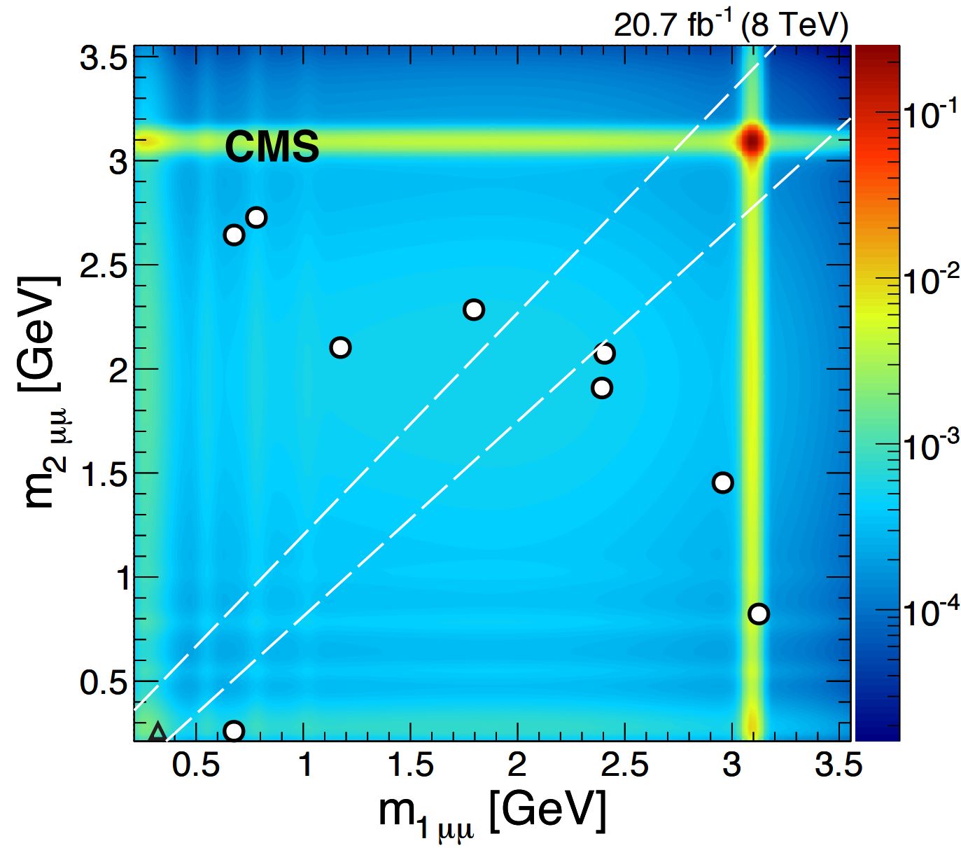
The graph is a figure from a CMS search for pair-production of pairs of light neutral particles, call them "a", when the latter in turn decay to pairs of muons. The reaction can thus be written pp -> aa -> μμμμ, so in the final state you have four muons; the a bosons in this search are supposed to be very light - lighter than the J/Psi meson, that is: less than 3 GeV. A new "a" boson could have a large branching fraction to muons in this region.
 By searching for this process without making any assumption on the mechanism which produces the "a" particles -it could be non-standard Higgs decays, or even more exotic processes - one is sensitive to several different classes of new physics models at once; for instance, the "a" particle could be a member of an extended set of Higgs particles arising in non-minimal supersymmetric models. Some motivation for this search comes also from astrophysical observations of a larger than expected fraction of positrons in the high-energy cosmic ray spectrum.
The plot shows the mass of one pair of muons versus the mass of the other pair. Only few events are found which pass all selection criteria, which are optimized to be sensitive to light a->μμ decays and consider the possibility of a significant lifetime of the a bosons. The white diagonal dashed lines indicate the region where the two dimuon masses are compatible with being equal, given experimental uncertainties: the dimuon mass measures the mass of the decayed "a" particle, and if that is the origin of both pairs, it must be the same - so the candidates lay on the diagonal. Only one event is found within the two lines: it is marked as a triangle, while all other 4-muon events have non-compatible dimuon masses and are labeled as circles.
If you are wondering what is the blue-yellow-red colour, it is easy to explain: it gives the scale of the expected backgrounds, which are mainly contributed by semileptonic decays of b-quark pairs; the highest background region is however the one where at least one of the muon pairs comes from the decay of a J/ψ meson - this is visible as the horizontal and vertical yellow band.
From the expected backgrounds and the small number of events observed along the diagonal, the CMS search sets generic limits on the cross section of the "a" particles times their branching fraction to muon pairs. These limits can be easily converted into limits on the various models that include these processes. For more information on this analysis, please see the arxiv paper here.


Comments