

I of course see myself that way, too. To me my job is a game -well, I see my life that way too! But I am divagating into philosophical observations which deserve another place to be discussed. Instead, here I want to show you why I think these detectors are marvelous toys. Give a look at the graph below, courtesy ATLAS.
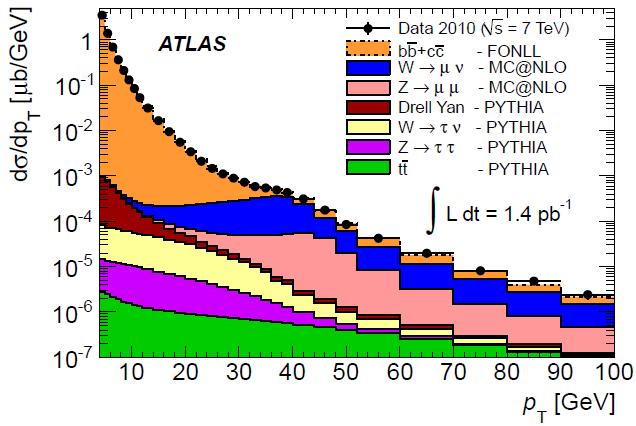
What you see here is a picture worth a million words -those that make up the literature containing the knowledge we need to understand it. It is a rather simple spectrum: the distribution of transverse momentum of muons detected by the ATLAS detector in a data sample of "only" 1.4 inverse picobarns. Yes, picobarns: a picobarn is a thousand femtobarns, so a inverse picobarn is a thousandth of a inverse femtobarn. And since the latter is nowadays used to size up the data collected by the LHC experiments, one is looking at a very small portion of the data collected so far by ATLAS (in fact, this is data collected in 2010). Still, it is a highly informative graph!
Muons are not the stuff that protons are made of: they can only be produced when quarks or gluons hit each other in a collision, generating new particles which in turn decay. So here we are looking at all possible sources of muons in the final state of proton-proton collisions delivered by the LHC, as a function of the transverse momentum that they are imparted with as they get kicked out of the center of the detector.
First of all, note that there are many processes which produce energetic muons. Actually, if you were smarter, you would figure out immediately that the legend is not even telling the whole story, and that some components must have been previously subtracted away. But we will get back to that detail; for now, let us take the information in the figure at face value and comment it.
By checking the figure we see that by far the most frequent one is the decay of heavy-flavoured hadrons (ones containing bottom or charm quarks, that is): they are shown in orange in the stacked-histogram overlay to the experimental data (black points). Since this is a logarithmic plot, you need to carefully look at the y axis labels to understand that b- and c-hadrons actually make up for 99.9% of all muons of transverse momenta lower than 20 GeV. Above that value, ones from the decay of W and Z bosons (in blue and pink, respectively) start to dominate, such that if you happen to see a muon of 40 GeV it is over twice as likely to be due from a vector boson decay than from any other source. Also note how the blue and pink distributions peak at slightly different transverse momenta -an effect of the higher value of the Z mass with respect to the W mass.
The "Drell-Yan" component is shown in brown just below the Z component. This is funny, if you think of it: the Drell-Yan process is the creation of a virtual photon, which then converts in a muon pair. But from a quantum-mechanical point of view, there is no way one can tell this process apart from Z production, and in fact the pink and the brown histograms are usually displayed together as a single distribution. Here, the analysts used two different simulation programs to calculate the two contributions, and they plotted them with different colours.
Further down we find muons originated from the decay of tau leptons, which in turn were due to the decay of W (in yellow) or Z bosons (in purple). Note how these muons have a much softer spectrum with respect to the ones directly produced by W and Z bosons discussed earlier: the tau decay produces not only a muon, but also two neutrinos, so the muon can only content itself with a share of the parent momentum.
Finally, in green one finds the top quark decay component. Top quarks decay into W bosons, and the W in turn may produce a muon: here in green are the muons produced by that decay chain. Noting again that this is a logarithmic plot, one wonders how much of a difference did the green histogram make in the understanding of the data distribution: since the data is not passing any top-enriching selection, the top fraction is never larger than a percent or two, even in the highest-Pt bins. Anyway, it is interesting to see how the top-pair component is really small in the original dataset!
And now, let us ponder on what was left out here. There is, in fact, one important other source of honest-to-god muons that ATLAS must see day in and day out: muons from decays in flight of pions and kaons!
Of course. The charged pion is the most frequently produced charged particle in a LHC collision, and it decays to a muon-neutrino pair most of the time. As for the charged kaon, it has more choices in its disintegration menu, but the muon is still one of the favourite products. So why did ATLAS produce a detailed graph of muons from all the considered sources, leaving aside pion and kaon decays ?
The reason is an important one, and it actually has to do with the very motivation for producing the graph in the first place. ATLAS will use muons from heavy flavour decays (the orange ones) for many physics measurements of bottom and charmed hadrons, and they will also use muons from vector bosons for a host of electroweak measurements and new physics searches. All of the sources of true muons must be understood well in order to enable such measurements: so what you are looking at is a study of the various components, after having removed the estimated contamination from muons originated in the decay in flight of pions and kaons. The latter constitute a annoying background, so ATLAS is showing that their removal is easy and well under control.
How is the subtraction done ? Well, pions and kaons have very long lifetimes if compared with all the other unstable hadrons produced in LHC collisions. Muons from these hadrons can get created centimeters, or even meters away from the collision point. They result in charged tracks which do not point very precisely to the collision point if traced back there; furthermore, their transverse momentum is also heavily biased when the reconstruction algorithm associates to the muon path detector hits which were actually produced by the parent hadron. Using these features, it is not hard to identify the "decay in flight" candidates and size them up, with the help of simulations and some extra assumptions.
There would be more to say about this point, but I think I exhausted your patience for today. But if you want more detail on the derivation of the graph above, and on the measurement that was performed with it, please see the preprint appeared today on the Cornell arxiv.


Comments