

1. Imitation or enactment
2. The act or process of pretending; feigning.
3. An assumption or imitation of a particular appearance or form; counterfeit; sham.
Well, high-energy physics is all about simulations.
We have a theoretical model that predicts the outcome of the very energetic particle collisions we create in the core of our giant detectors, but we only have approximate descriptions of the inputs to the theoretical model, so we need simulations.
E.g., the parton distribution functions f(x,Q^2) of quarks and gluons inside the proton, which determine how probable it is to find a particular such "parton" inside the proton carrying, at a given instant of time, a certain fraction x of the total proton momentum, if we take a picture of the proton with a collision releasing an energy squared equal to Q^2.
In addition, we cannot compute the predictions of the theory to arbitrary accuracy - we have a wonderful theoretical description, that's true, but it is damn hard to do the calculations, so we can only get approximate answers.
Furthermore, the knowledge of the details of the interaction of the produced particles with our detectors is not completely precise: we know what happens, and we can describe it mathematically, but again there remain small approximations in the calculation, due to imprecise knowledge of some crucial subnuclear reactions.
Finally, the processes that take place when particles interact with matter are stochastic in nature - the same initial conditions give rise to different outcomes, depending on the intrinsic randomness of quantum physics.
So we simulate.
We run complex computer simulations of all the phases of physical processes we believe take place when two particles - say two protons accelerated by the Large Hadron Collider (LHC) - collide. We interface these simulations with precise theoretical calculations of specific bits of the whole chain of processes, to make the predictions as precise and conform to our theoretical model as possible. What we end up with is a (usually very large, otherwise it would be pointless) dataset of simulated events: detector readouts of the result of collisions that never took place, but which reflect our understanding of what could have happened. The dataset must be large so that we get to monitor the whole range of possible outcomes, with high statistical precision.
What use do we exactly make of those large data samples? We compare them to real data, to understand whether the theoretical model is accurate, or if there is an anomaly in the data that the simulation cannot account for.
In most cases the anomaly is only due to some shortcomings of the model, or the simulation procedure. Only in exceedingly rare cases does the observed discrepancy come from the presence in real data of some physics process that the simulation did not know about. That is the spark that lights up all warning lights and alarm bells: a discovery is in the making !?
A discovery can be made by finding a genuinely new process, never before observed: this was the case, for example, of the Higgs boson, found in 2012 by CMS and ATLAS experiments at the CERN LHC. The two experiments painstakingly studied dozens of different processes where the Higgs boson could show a faint signal of its presence, and collectively they proved that the observed differences between observed and predicted data could only be explained by the new particle.
But a discovery can also arise when a well-known process is studied with great accuracy, by measuring its properties in detail and demonstrating that the observed properties do not match theoretical predictions. This kind of discovery is usually more complex to make, as the absence of a "smoking gun" signature in the data, like a peak in a reconstructed mass distribution usually provided by the signal of production of a new particle, or an unaccounted-for excess of events of some special kind only explainable by the decay of a new resonance, makes the interpretation of the anomaly more controversial.
Now, the new release of analysis results by the CMS collaboration summarized in the "Physics Analysis Summary" labeled as TOP-17-014 may well belong to the rare cases of a discovery in the making, as the discrepancy reported there is large, multi-dimensional, and unexplained. However, in my opinion it is exceedingly improbable that the observed disagreement is really caused by some new physics process, as what is observed is a difference between data and simulations which has all the characteristics of a shortcoming of the simulation.
Whatever the cause, it is our job as experimentalists to take that anomaly seriously, and consider with care what could be its origin: mismodeling, or new physics. For even just the "null result" consisting in a demonstration that Monte Carlo simulations are to be revamped would be a significant advancement in our understanding of subnuclear phenomena - in this case, it would foster the acquisition of deeper knowledge after the tuning of the simulation.
One thing appears quite clear from the outset: what CMS sees is not the effect of a statistical fluctuation. The collected data has a high statistical power, and the effect appears to be systematic in nature.
Top quark decays
The CMS experiment collected a very large number of decays of top quark pairs, produced in 13-TeV proton-proton collisions during the 2016 run of the CERN LHC. These events were selected in a decay mode known for its very high purity: the so-called "dilepton" final state, which at the LHC can be selected with signal-to-background fractions exceeding 4 to 1.
The dilepton final state arises when both top quarks decay into a bottom quark accompanied by an electron or muon and the corresponding neutrinos. All in all, one has two energetic and well-measured leptons, two b-quark-originated jets of hadrons, and very large missing energy -an imbalance in the momentum balance of the event produced by the escaping neutrinos, which leave no trace in the detector. The decay is shown in the picture below.
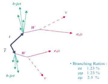
Only 5% of all top quark pairs decay this way (the picture show the individual branching fractions to two electrons plus jets and missing energy, two muons plus jets and missing energy, and the mixed "one electron and one muon" plus jets and missinge energy mode), but the top pair production rate of the LHC is very high, so CMS could collect 255 thousand candidates, out of which over 200 thousand should be genuine top quark pair decays.
The events, once reconstructed by a "kinematic fitter" (a program that finds the most likely configuration of all produced final state particles, based on the properties of the observed ones), allow the detailed study of a large number of kinematic variables, such as top quark momenta and angles. If the same reconstruction procedure is performed on simulated top quark pairs, and the contaminating effect of all contributing backgrounds is accounted for, one can compare the predicted and observed behaviour of top quarks, and draw some conclusions.
What conclusions can one draw from a graph such as the one shown below, which describes the variable called "top quark transverse momentum" ? First of all, one notices that the y axis in the upper panel is logarithmic: this means that the data (black points) are compared to the sum of all simulated processes (filled histograms of different colours) over a wide range of relative frequency: the most populated bins contain 50,000 events or so, while the less populated ones contains only a handful of events each. The general agreement of data and simulation appears really very good from the upper panel. And yet, we should look more closely.
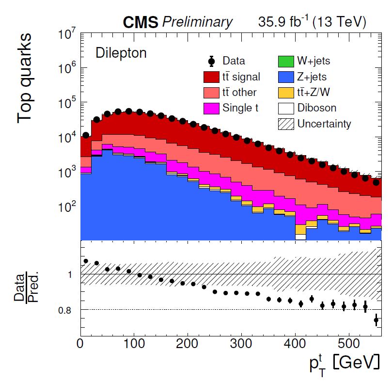
The lower panel shows the ratio between observed and predicted relative rates, also as a function of the top quark transverse momentum. Here one would expect that the black points (which show the computed ratio) would bounce around the line at 1.0. But they do not: there is a definite downward trend in the ratio. Is it significant ?
You may note how a dashed "uncertainty band" describes how precisely the ratio is predicted, accounting for systematic uncertainties affecting the simulation; the vertical bars on the data points instead describe the statistical uncertainty on the measured data. While the graph does not explain the degree of correlation between the systematic uncertainties affecting one mass bin and another, the observed trend still appears quite significant, as it is very consistent and not explainable by a global upward or downward shift of the line sitting at 1.0.
I realize the above is a rather technical point, so let us move on. The graph above is but one in several dozen published in the CMS article. And the top quark transverse momentum does not appear to be a single exception in an otherwise pool of agreeing variables: a significant fraction of the studied distributions shows similar discrepancies. It appears that the simulation of top quark pair decays, which is being tested to a high degree of precision using the large dataset collected by the experiment, shows cracks difficult to repair.
Goodness of Fit
In the article several different simulations are studied, and their predictions are compared to the data using a very common "goodness of fit" test statistic: the chisquare. While in general when talking about comparisons of datasets one should keep in mind that there does not exist a "best" test statistic, as the one which is more effective in detecting a discrepancy from two datasets drawn from different density functions depends on the shape of those densities, some notes can be made of the chisquare.
The chisquare is the sum of differences in observed rates in the bins of the histograms, each weighted with the inverse of the total uncertainty. So, for instance, if you have one bin where you observe O data events and you expected E, this will contribute to the chisquare by the amount (O-E)^2/(ΔO^2+ΔE^2), where the denominator contains the individual uncertainties on O and E, each squared. The difference O-E at the numerator is also squared: large differences (in units of the uncertainty on the difference) weigh more.
Being a sum, the chisquare is oblivious of where the discrepancy comes from: so if you have a general agreement between data and model in all bins except the last five, but the last five are all showing large excesses, O>E, you get the same chisquare as if the five discrepant bins were scattered around without purpose in the spectrum, and some of them showing positive and other negative fluctuations. In other words: the chisquare does poorly as a measure of discrepancy in some restricted portion of the investigated spectrum.
For the same reason, if the difference between data and model shows a trend, as is the case of the top pT distribution shown above, the chisquare will be oblivious of it: it will only report a general disagreement, but it will not be as strong a measure of discrepancy as could be other goodness of fit tests more sensitive to collective behaviour, such as the Kolmogorov-Smirnov test, the Anderson-Darling test statistic, or others.
That said, there is not much to criticize about using the chisquare: it is just one way to quantify the general level of agreement, when one has no clue of what is going on - which is exactly what is happening here. The article has long pages full of graphs like the one shown above, where each kinematic quantity is compared to several different Monte Carlo models; to complement the graphs, there are tables of all the chisquare values when comparing each model to the data.
What does one do with the chisquare, by the way? One can compute the probability of observing data at least as discrepant with the model as those observed, when the model is correct. Given the value of chisquare you observe and the number of bins in the histogram, this is a simple calculation to make. So you end up with p-values. One example of a table of chisquares and p-values is shown in the clip below.
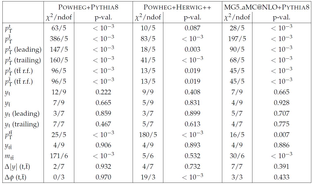
As you note, there are lots of discrepancies in the studied distributions. When you look at p-values, you would expect them to have random values from zero to one, but here many of them are at the level of 10^-3 (which corresponds to a "three-sigma" effect) or below. It is fair to say that no Monte Carlo simulation manages to get even close to describing the data, although the Herwig hadronization model seems to give better results than the others. [Hadronization is the phase successive to the top quark decay, when all quarks and gluons "dress up" into colourless objects - hadrons - and emerge as collimated jets of such particles.]
Now, if you are a theorist and you have lots of time in your hands, you should run to the blackboard and try to cook up a model of new physics that can produce the observed discrepancies - you might be lucky and win a Nobel prize that way. Or if you are a model builder, you should go back to your computer and try to tweak it such that the produced differences go in the right direction of explaining the departures of CMS data.
If you are an experimentalist who has not worked on this particular analysis, as I am, you can instead sit back and relax - this is an interesting result in its own right, but you should not lose your sleep on it. The tweak will be found!
----
Tommaso Dorigo is an experimental particle physicist who works for the INFN at the University of Padova, and collaborates with the CMS experiment at the CERN LHC. He coordinates the European network AMVA4NewPhysics as well as research in accelerator-based physics for INFN-Padova, and is an editor of the journal Reviews in Physics. In 2016 Dorigo published the book “Anomaly! Collider physics and the quest for new phenomena at Fermilab”. You can get a copy of the book on Amazon.


Comments