


As soon as I can get the upload to work I intend to upload all of my sql code used to process this data for inquiring minds and anyone who'd like to duplicate this work.
There are many different ways surface temperature records have been examined, all of which require taking some liberties with the actual data. The approach taken here is to generate a daily anomaly value (today’s minimum temp – yesterday’s minimum temperature) for each station, then average this Difference value based on the area and time period under investigation. This doesn’t create a spatial average, but it does create an average value based on a collection of measurements for a specific area. By working with only the minimum temp measurements we get a view of the dynamic atmospheric response to the daily solar input.
The charts below are based on this methodology.
The data used is the NCDC’s Global Summary of Days data, the GSoD series starts in 1929 and currently contains nearly 120 million records distributed as show below. This charts shows one of the issues with previously constructed spatial records, prior to 1973 there are far fewer samples available to reconstruct the surface record thereby increasing the error on any value generated (note the last count listed was just the count of the original data set worked with, these charts have a full set of data through 2012).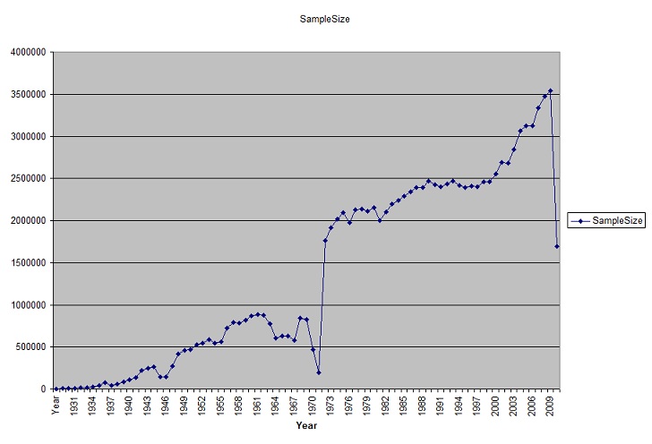
This is a very active time in climatology, the big news is temps have stopped rising, while Co2 continues to increase.
This is the global annual average of both the daily minimum temp diff and the daily maximum diff (mx – ymx). To reduce the effect of stations with sporadic logging, all stations included in all of these charts logged data at least 240 days per year and for a minimum of 10 years.
Figure 1: Global Stations, This is the annual average of the difference of both daily min and max temperatures, the included stations for this chart as well as all of the others charts have at least 240 days data/year and are present for at least 10 years. 116 million samples.
The first thing to note is that warming doesn’t really look like warming, it looks like a recovery from a pronounced cold spell.To further our understanding on what is happening with the climate, we need to look at the spatial information captured by surface stations.
Figure 2: Mid Latitude Northern Hemisphere Stations (24.950-49.410Lat, 180.000- -8.000 Lon and 24.950-49.410 Lat, -67.00- -124.800 Lon) divided into Eurasia(32M samples) and the US(24M samples).
Looking at the northern mid latitudes there is a clear difference how the 20th century temperature trends were distributed, US stations recorded no trend in temperatures from about 1945 to 1973, the annual daily min and daily max temperatures averaged out to near zero, followed by a drop in minimum temps, returning to a near zero trend approximately in 2000. While Eurasia registered a large drop in minimum temperature starting in 1948 and has been recovering ever since, again returning to a zero trend in 2002. Both areas show the return to a zero trend during the same period that’s referred to as the “pause”.
Figure 3: Mid Latitude Southern Hemisphere stations (-23.433- -66.562 Lat, -30.000 – 180.000 Lon, -23.433 - -66.562 Lat,-30.000 - -100.000Lon and -23.433 - -66.562 Lat, -100.000 --180.000 Lon ) divided into South America(4.6M), Africa(1.8M) and Australia(62K).
Looking at the data from southern mid latitudes, again there is a near zero trend from1950 to 1968, where Africa showed a single year drop, both South America and Africa show cooling from ~1973 through the early to mid 90’s, again followed by a near zero trend after the early 90’s. But it’s also important to note that after the late 40’s Australia shows no trend. Taken together a couple of things are clear, for most of the world there was no trend in minimum temperature whenCo2 increases became significant, and then in the early 70’s most of the planet experienced a significant drop in minimum temperature, followed by a slow recovery.My teachers always told me to show my work.


Comments