

"A new data display tool does not triumph by convincing its opponents and making them use it, but rather because its opponents eventually die, and a new generation grows up that is familiar with it."
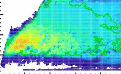 When I started working in HEP twenty years ago, it was not uncommon to see histograms shown as HBOOK ascii-art printouts -quelle horreur! Now HBOOK is defunct, and most of the times the data is displayed using eye-catching colours and layouts. Let's take the graph on the right, which I have clipped from a recently produced figure: Nice, isn't it ? Sure. But what does the figure represent ? What is show on the x and y axes ? What do the different colours indicate ?
 I am not sure I should provide any information to help you answer the above questions, because the figure is indeed full of features and quite recognizable -if you work in HEP. Let me just say it is a by-product of recent investigations in collider physics...
As always, I invite those who know nothing about the figure to try their luck and guess what the plot is, writing their answer in the comments thread. Those of you who know exactly what this is should instead please abstain for the next 24 hours, to avoid spoiling the fun...


Comments