

There is a deep, pragmatical reason, by the way, why economical display of information is valuable for a HEP experimentalist: we see far too many graphs every day... And most of them are routinely produced without thinking too much at their clarity. If you sit in internal meetings of a typical collider physics experiment, you most of the times find yourself staring at a powerpoint slide with a graph with no axis labels or unreadably small ones, with multiple histograms overlaid one on top of the other such that none is visible clearly, etcetera, etcetera, etcetera.
You cannot really blame the speaker -they are most of the times overloaded graduate students who produced the plot ten minutes before, with their advisors yelling at them on their back in the meantime. But it's really a headache at times -and one cannot always rise his or her hand to ask the speaker for more explanation, so sometimes one just sits back and assumes that the information provided in the graph was not too relevant, otherwise the producer of the figure would have spent more time putting it in a more readable format. But this is a failure for both the speaker and for you.
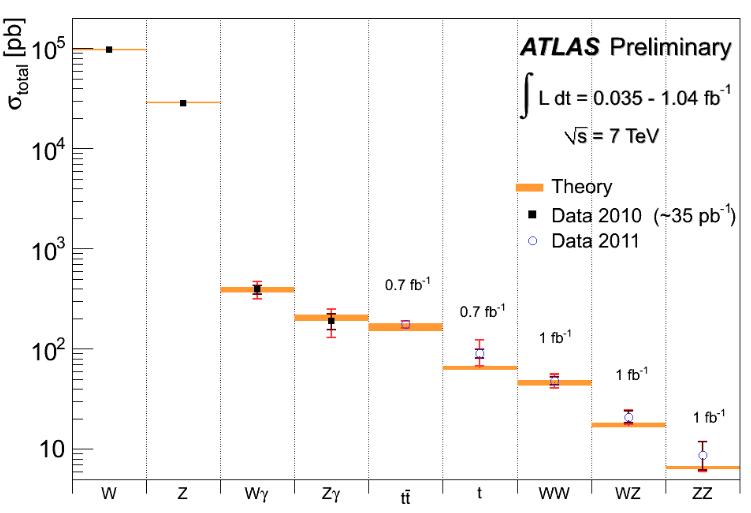
So, well-crafted figures are valuable. Below is one, courtesy ATLAS collaboration. Of course it was not ATLAS which invented this particular graph - the plotting of different process cross sections in the same figure, as a way of both comparing them quantitatively on a log scale and comparing each with the theoretical prediction, is a rather well-established practice. Nonetheless the figure has charm. Even leaving aside the appreciation of the sound graphical choices, there is something to praise about the content, which is a five-star one. You get to see at a glance what is the rate of the different production processes of heavy objects (W and Z bosons, alone and with accompanying photons or other W and Z, and top quark pairs) at the Large Hadron Collider, as currently measured by ATLAS, and how these measurements compare with electroweak theory predictions. Marvelous, isn't it ?
Now think at the fact that most of the 6000 physicists working in CMS and ATLAS are working to try and prove wrong the Standard Model, the theory which provides us with such a delicious understanding of subnuclear interactions, and you get the picture: physicists are never happy to fully understand something -they want to find something they do not understand! Yeah, that's just so much more fun...


Comments