


An interactive map of U.S. carbon dioxide emissions from fossil fuels says we still have things to learn about where it's coming from - and where the worst offenders are.
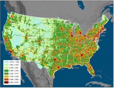
The maps and system, called Vulcan, show CO2 emissions at more than 100 times more detail than was available before. Until now, data on carbon dioxide emissions were reported, in the best cases, monthly at the level of an entire state. The Vulcan model examines CO2 emissions at local levels on an hourly basis.
Researchers say the maps also are more accurate than previous data because they are based on greenhouse gas emissions instead of estimates based on population in areas of the United States. The increased detail and accuracy of Vulcan will help lawmakers create policies to reduce CO2 emissions while also increasing scientists' understanding of the sources and fate of carbon dioxide, researchers say.

"For example, we've been attributing too many emissions to the northeastern United States, and it's looking like the southeastern U.S. is a much larger source than we had estimated previously," says Kevin Gurney, an assistant professor of earth and atmospheric science at Purdue University and leader of the project.
To create the Vulcan maps, the research team developed a method to extract the CO2 information by transforming data on local air pollution, such as carbon monoxide and nitrous oxide emissions, which are tracked by the Environmental Protection Agency, the U.S. Department of Energy and other governmental agencies.
"These pollutants are important to determine the ozone levels and air quality in major cities, and they are tracked on an hourly basis," Gurney says. "We've been able to leverage that data to determine the levels of CO2 being produced."
Carbon dioxide is the most important human-produced gas contributing to global climate change. The United States accounts for about 25 percent of global CO2 emissions.
"Before now the only thing policy-makers could do was take a big blunt tool and bang the U.S. economy with it," Gurney says. "Now we have more quantifiable information about what is happening in neighborhoods, on roads and in industrial areas, and track the CO2 by the hour. This offers policy-makers something akin to a scalpel instead."
Gurney says the inventory system, which is named for the Roman god of fire, quantifies all of the CO2 that results from the burning of fossil fuels such as coal and gasoline. It also tracks the hourly outputs at the level of factories, power plants, roadways, neighborhoods and commercial districts.
A preliminary analysis of the Vulcan data suggests that previous maps of U.S. fossil fuel emissions were inadequate for current scientific and policy-making needs, Gurney says.
"When you compare the old inventories to Vulcan, the new data show atmospheric CO2 differences that are as large as five parts per million in some U.S. regions in the late winter," he says. "The levels in the global atmosphere only rise one and a half part per million every year, so this is the equivalent of three years of global emissions in the atmosphere that isn't where we thought it was. This will be important for policy-makers and is enormous from a scientific point of view. It's shocking."
Gurney says this change isn't only due to people moving to the southeast, but also because of the approximations of previous estimates.
James Hansen, director of NASA's Goddard Institute for Space Studies, says Vulcan provides a "check" to judge the accuracy of existing satellite data.
"The high-resolution map from Vulcan also provides a picture of emission sources in a way that the public and policy-makers can understand, which may be helpful in discussing what we will do about the climate problem," Hansen says.
The three-year project, which was funded by NASA and the U.S. Department of Energy under the North American Carbon Program, involved researchers from Purdue University, Colorado State University and Lawrence Berkeley National Laboratory.
Robert Andres, a senior researcher with the Carbon Dioxide Information Analysis Center at the U.S. Department of Energy's Oak Ridge National Laboratory who is not affiliated with the project, says Vulcan will provide scientists with many insights into the global carbon cycle and climate change.
"Vulcan will be revolutionary in carbon cycle research," he says. "It is the next generation in our understanding of fossil fuel emissions. The implications for climate science, carbon trading and climate change mitigation work are tremendous."
To extract the CO2 information from the data on other pollutants, research scientists in the Office of Information Technology at Purdue developed a computational system to apply Gurney's methods to existing information.

Once the data was converted to determine the CO2 emissions, it was combined with geographic information systems (GIS) data to layer the emissions onto roads and other infrastructure at the Earth's surface. The current emissions are based on information from 2002, but the Vulcan system will soon expand to more recent years.
Gerry McCartney, vice president for information technology and chief information officer at Purdue, says the digital data conversion developed by Gurney and IT research scientists at Purdue will advance both climate science and information technology.
"This was an important project that required a massive amount of data and a large number of people with highly technical skills," McCartney says. "Vulcan is a part of a larger vision for tracking greenhouse gas emissions around the world, eventually even in real time, and we are pleased that Purdue possesses the resources and technical ability to take on a project of this scale."
Vulcan is expected to complement NASA's planned December 2008 launch of the Orbital Carbon Observatory satellite, which will measure the concentration of CO2 in the Earth's atmosphere.
"Our understanding of atmospheric CO2 we gain from Vulcan and from NASA's satellite will be enhanced tremendously by combining them," Gurney says. "It's like the old photographs found in stereoscopes or View-Masters. Each image is nice, but when you put them together you achieve a 3-D view that gives you much more information."
The Vulcan data is available for anyone to download from the Web site at http://www.eas.purdue.edu/carbon/vulcan. Smaller summary data sets that offer a slice of the data and are easier to download also are available for non-scientists on the Vulcan Web site. These can be broken down into emission categories, such as industrial, residential, transportation, power producers, by fuel type, and are available by state, county, or cells as small as six miles (10 kilometers) across.
The animation was created by Bedrich Benes, assistant professor of computer graphics technology and a research scientist in Purdue's Envision Center for Data Perceptualization, and computer science graduate student Nathan Andrysco. The animation required a year to produce, and the rendering of the animation (the video equivalent of printing) required nine hours to produce the 2,000 images that make up the 60-second video.
"To do this, we built from scratch a software program that is specifically tailored to visualize greenhouse gases," Benes says.
Although Vulcan can be used to pinpoint CO2 emissions down to the levels previously unseen, Gurney says the tool should not be used to affix blame.
"Ten years ago there might have been resistance to the notion of examining who is responsible for the CO2 emissions in such a visually detailed way," Gurney says. "However, what Vulcan makes utterly clear is that CO2 emissions cannot be exclusively affixed to SUV drivers, manufacturers or large power producers; everybody is responsible. We need to look for real solutions, and have a deeper discussion about energy use. It's not about politics. It's about doing good science and solving the problem, and we can all be a part of that."
More about Project Vulcan.
NOTES:
1. These images were produced by comparing the atmospheric CO2 concentration arising from simulation of two different fossil fuel carbon dioxide emission inventories through the Parameterized Chemistry and Transport Model (PCTM). The first inventory is the Vulcan 2002 inventory regridded to the 1x1.25 degree PCTM grid and integrating those emissions for one full year. The second inventory is the Brenket et al., 1998 fossil fuel CO2 emissions inventory also regridded to the 1x1.25 degree PCTM grid but scaled up at all cells to match the 2002 Vulcan US total carbon emissions.
The differences shown in the online images are obtained by subtracting the outputs obtained from Brenkert et al. emissions from the the Vulcan emissions at the second layer (850 mb) of the atmosphere from the surface. The Winter mean is obtained by averaging the results of the months of December, January, and February and the Summer mean is obtained by averaging the months
of June, July, and August, the Annual mean encompasses the entire year.
- Steve Tally, Purdue University


Comments