


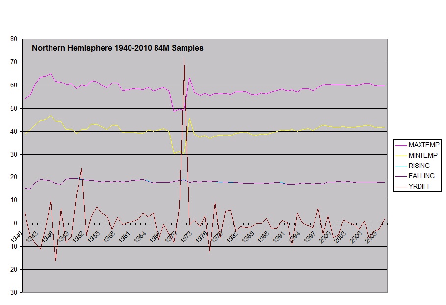
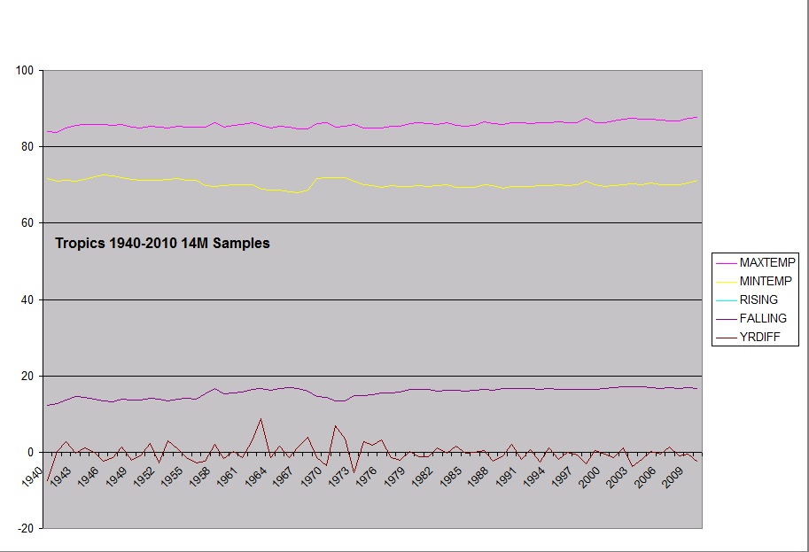
Also based on emails with Dr Roy Spencer, he suggested that I remove stations that are not present through the majority of the time period analyzed. This was done for NH,SH and Tropics charts, where to be included the station had to have 240 days of data over at least 40 years from 1940-2010.
These are the updated graphs.
Global averages all stations:
 Map of global stations
North Pole (>66.5 Lat)
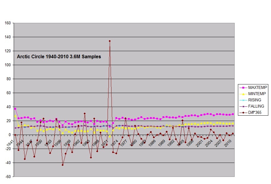
Map of NP Stations
Northern Hemisphere (<66.5 >23 Lat)
Western Northern Stations
Eastern Northern Stations
Tropics (> -23Lat to < 23Lat)
Tropical Stations
Southern Hemisphere (>-66.5 <-23 Lat)
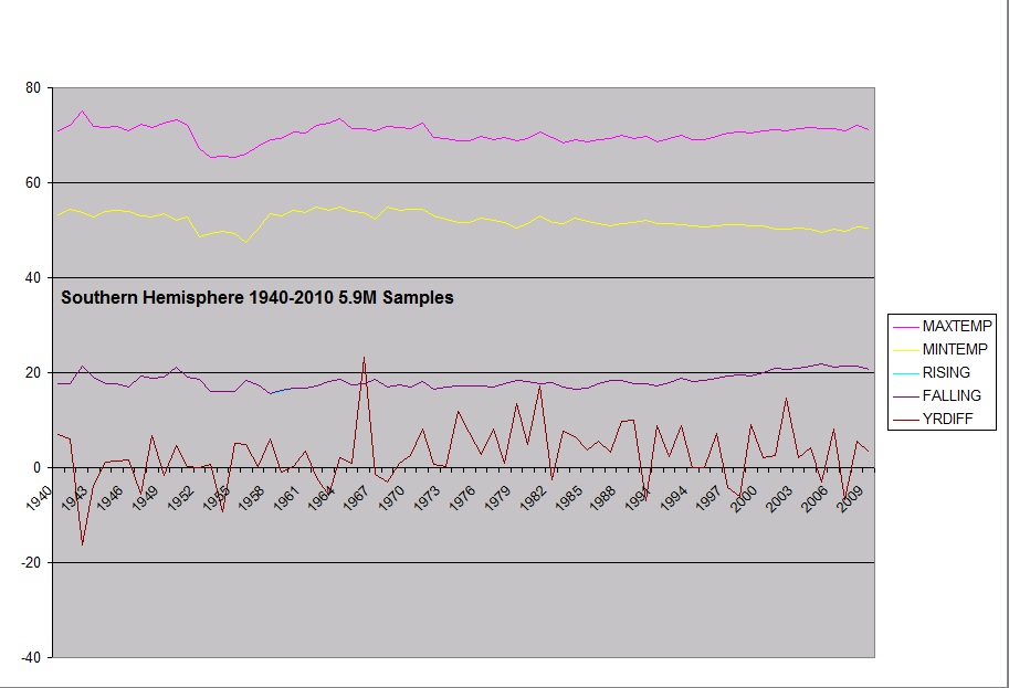
I think it's interesting to note that minimum daily temps in the SH have been dropping since the 80's.
Southern Stations
South Pole (<-66.5 Lat)
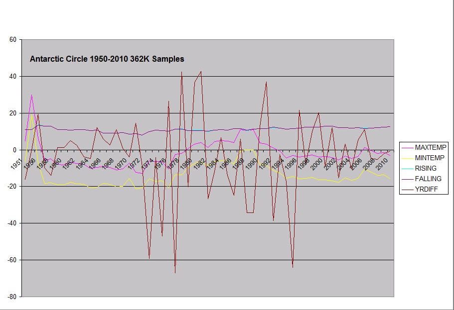
Antarctic Stations
I also multiplied the daily average difference value by 365 to get a annual value which goes better to the average annual temperatures.
Edit, I split the NH and SH to break out the Arctic/Antarctic circles.


Comments