


A site called Social Predictor (sociadictor.com) predicts future trends based on the number of tweets, sentiment of tweets, number of news stories and sentiment of the news stories about celebrities and culture. It can also try and predict stock prices or daily sales of a product, based on the chatter related to user-input keywords, such as a stock ticker or the name.
The creators said trading strategy based on their model outperformed other baseline strategies by between 1.4 percent and nearly 11 percent and did better than the Dow Jones Industrial Average during a four-month simulation.
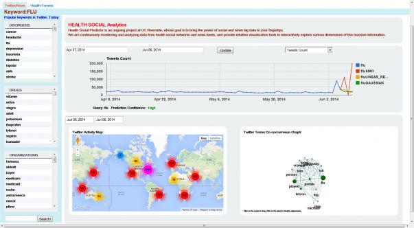
Now they have created a tool to analyze tweets about the flu, how they are dispersed geographically down to the street level and even predicting of the number of tweets about the flu in the coming days. Health Social Analytics (healthsocialytics.com) visualizes data about health-related disorders, drugs and organizations from Twitter, news stories and online health forums, such as WebMD, does all of that.
Credit: UC Riverside
The site is the work of Vagelis Hristidis, an associate professor of computer science at the Bourns College of Engineering at the University of California, Riverside and a team of researchers. The tool has applications for a wide range of groups. Government agencies could use it when preparing for a public health emergency, such as the H1N1 (swine) flu scare in 2009/10. Drug companies could use it to check the sentiment and volume of online chatter related to their drugs and these of their competitors. Media outlets could use it to track trends. Health psychologists could use to learn what keywords dominate health-related forums or which disorders have the biggest online communities.
The Health Social Analytics site breaks keywords into three health categories: disorders, drugs and organizations.
Once a keyword is selected, the page refreshes and displays a line graph in the center. On the line graph, there is a pull down menu with 16 categories that can be viewed. Most categories have to do with the number and sentiment of tweets and news stories. The user can adjust the start and end date of the graph.
In addition to the line graph, there is a Google map with color coated numbers showing high concentrations of tweets about that keyword in different parts of the world. The tweets can be broken down to the street level. The start and end date of the data collection can also be adjusted. Finally, there is an interactive graph that looks like a spider web. It shows the selected keyword in the center and other words commonly found alongside it in tweets. The more common the word the larger the green circle next to it.
Source: UC Riverside


Comments