


"In the beginning" were more than just words — they were the beginning of printing presses and typography that brought new depths of meaning and creativity to language. For some designers and printers, the ultimate challenge is the Bible, the design of which could be affected by politics and religious beliefs, as well as by aesthetic and commercial concerns.
Patsy Watkins studied five bibles created from the mid-15th through the 20th centuries to see if the designers’ motives could be discerned within their design and typefaces. The Visual Communication Quarterly published her findings, “Designing the Holy Bible: Arguing the TEXT Through the Form,” in its latest issue devoted to typography.
She chose the Gutenberg Bible, the Martin Luther Bible, the Doves Press Bible, the Washburn College Bible and the Pennyroyal Caxton Press Bible. What she found was that form indeed revealed function as well as the designers’ desire to shape the meaning and hence a reader’s understanding of this ancient text.
“One could say the act of redesigning is ideology through the choices made in type and page layout,” said Watkins, chair of the journalism department in the J. William Fulbright College of Arts and Sciences at the University of Arkansas.
Johaness Gutenberg, credited with inventing movable type printing around 1450, chose the bible as his first project. He had many motives: to show a printed book could be as beautiful as a written manuscript, to show his new technology could create a work of artistic beauty and to promote his new invention. In the process, he accomplished what no scribe could: a rigorous justification of text on the page.
Martin Luther translated his bible in a vernacular German in order to make it a “people’s book” more easily accessible than the existing bibles, which were written in a form of “Germanized Latin” difficult for most people to read and understand. Thus the content itself represented a radical split from Catholic authority, while the design was noticeably different from the Gutenberg version. The text block itself is one wide column and the pages have a look of a storybook, rejecting the formality of a more traditional bible.
“The Luther bible is a visual marker of one of the most significant developments in the history of the Christian faith,” Watkins writes.
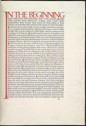
Watkins said that Thomas Cobden-Sanderson, who is given credit generally for designing the Doves Press Bible in 1903, was a fanatic about perfection, pathological about religion and — judging from his diaries — completely self-absorbed.
The “I” of “In the beginning” stretches the entire length of the page, perhaps pointing to the enormity and omniscience of God. Watkins believes the “I” is a definite visual punctuation of the beginning of all time, closing off any other concept of “the beginning.”
The most modern of the bibles is the Pennyroyal Caxton Press Bible, published in 1999. In it, designer Barry Moser uses woodcuts to reflect people he described as “like you and me. People who have crooked teeth and bad skin. Who have stinky breath and dirty feet.”
The design of the text creates a fitting stage for these people. As Watkins notes, the first page of Genesis is simple but majestic: the word “GOD” is set in heroic red capitals in the top third of the page, resting over two columns of text. Red is the only color throughout, used to highlight GOD, CHRIST at the beginning of the New Testament, AMEN at the end of Revelations, and the initial letters at the beginning of each of the 66 books.
Watkins views the Pennyroyal bible as more of an expression of Moser’s own life's journey from dedicated Methodist preacher, through total disillusionment with the church to his complete immersion in the scriptures and religious music when he took on the project. Moser is in his 60s now, and appears to have gone through a lonely and desperate self-examination of his life in taking on the Bible.
“I'm never satisfied with describing him,” Watkins said. “Creating a bible is a tremendous physical, creative and courageous task. It's really fascinating to try to figure out why designers have done it.”


Comments