 |
 |
| NASA 'worm' logo, used 1975-1992 and completely eradicated by 1997 |
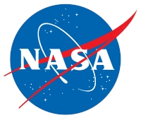
NASA 'meatball' logo, used 1959-82 and 1992-present |
What could be controversial about the meatball? Primarily, people don't like change. Also, some thought it was a political decision, with opinions ranging from "new director wants to put his stamp on agency" (as it was well acknowledged that Daniel Goldin hated the 'worm') to "trying to disassociate from the Challenger incident".
In either case, we have two designs. I'm a meatball fan. Which do you prefer?
Over and out,
Alex
Tuesdays at The Satellite Diaries and Friday at The Daytime Astronomer (twitter @skyday)
p.s. thanks to Marc Kuchner for pointing this out!


Comments