


In one of my snarkier moments, I coined the term "Dog's Ass Plot" (DAP) in reference to
A graphical representation of data in any field that, through a lack of clear axis labels, selective inclusion/exclusion of data, visual presentation style, and/or other questionable characteristics, generates a misleading interpretation of the data in the viewer, especially by implying an illusory pattern that is not supported by the available data.
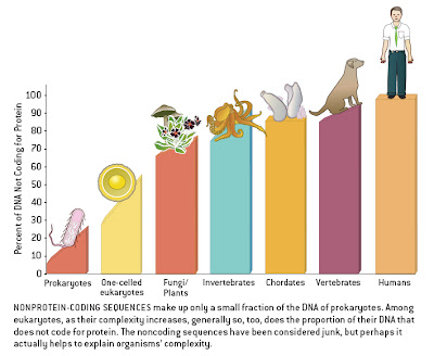
This was based on a figure that purported to demonstrate a relationship between non-coding DNA and complexity.
As I noted,
The sloping of the bars within taxa suggests that this is meant to imply a relationship between genome size and complexity within groups as well, with the largest genomes (i.e., the most non-coding DNA) found in the most complex organisms. This would negate the goal of placing humans at the extreme, as our genome is average for a mammal and at the lower end of the vertebrate spectrum (some salamanders have 20x more DNA than humans). Indeed, the human datum would accurately be placed roughly below the dog's ass in this figure if it included a proper sampling of diversity.
Now, GraphJam has posted a figure that is not only a superb DAP (i.e., the presentation implies a pattern that extends beyond the data themselves), but a Human's Ass Plot, or a HAP DAP:


Comments