

Science writers and media reporters owe a duty of care to their readers: a duty to present facts undistorted by personal opinion or agenda.
That duty of care extends not just to what is written, but to what is portrayed in graphs and images.
A graphic produced for a specific science-oriented context can be as misleading if taken out of context as any cherry-picked data or quoted words.
The graphics and information in the image below are often reproduced without explanation on sites which use such images to back up what they are gleefully reporting: that the Arctic sea ice is nearly back to normal. It isn't. Far from it.
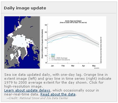
image source: http://nsidc.org/arcticseaicenews/
The above map and graph are most definitely not being presented by NSIDC as showing the ice area or extent for any specific day or week. The map and graphic are visualisations of data products subjected to an averaging process with various approximations, assumptions and interpolations.
I will say it again: the map is not intended to show an at-a-glance snapshot of what the Arctic would look like if you looked straight down at the pole from space.
The map has a purpose which I shall try to explain. First, let us compare the latest map-as-data-plot with the latest map-as-mosaic of RGB channel true color images.

April 23 2010 - Sea Ice Extent graphic.
image source: http://nsidc.org/arcticseaicenews/
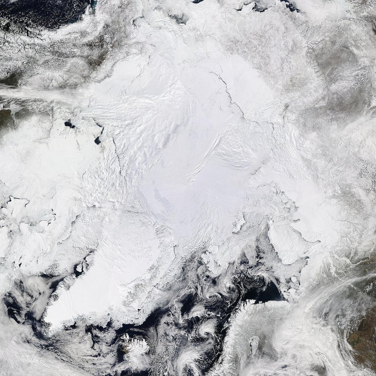
April 22 2010 - Arctic Mosaic - MODIS/Aqua 4km resolution True Color 2010/112 (04/22/10)
Image reduced in size to fit article layout. Full size download zip file here.
Images source: http://rapidfire.sci.gsfc.nasa.gov/
Why are these images so different?
The mosaic is stitched together from the satellite's RGB channel data collected during the course of a number of orbits. The RGB data has a resolution of 250 meters per pixel. The composite image, at 4km resolution, shows the Arctic ice to a very close approximation as it would have appeared to a human observer looking down at the pole on April 22 2010.
In contrast, the NSIDC graphic represents an average of data over a 30 day period. It is not intended to show ice area or extent on any specific day. It has a resolution of 25km per pixel.
It is inherent in any imaging device that at the limit of resolution it will show something like an average of the frequency or frequencies being sampled. Thus, if the MODIS images at 250m resolution show ice, it may be taken that at least 50% of the area covered by the pixel is really ice covered.
By way of contrast, the NSIDC pixel of 25km resolution is mathematically derived. It will show ice if, during a period of 30 days, the area portrayed by the pixel had an average of at least 15% ice cover. A white pixel in the graphic does not necessarily represent current realities.
Ice area and extent
Imagine a square kilometer of continuous and unbroken ice. It has an area of 1km2 and an extent of 1km2. Now let us imagine it is fragmented and spread out over a sea area of 1.5km2. The area of ice is still only 1km2, but that ice has been extended over a sea area and now has an extent of 1.5km2.
Ice extent is the sea area covered with ice from a concentration of 15% up to 100%. It is the cumulative area of all grid cells having at least 15% ice cover on average over the 30 day data collection window.
Ice area is the cumulative area of all the various bits of ice. It is the sum of ice percentages in all grid cells having at least 15% ice cover on average over the 30 day data collection window.
In other words, ice area takes into account that there is a fraction of open water in pixels with ice concentration above 15 % and below 100%".
Ice extent does not include this effect and gives therefore a higher number of square km than ice area. The NSIDC graphic shows ice extent - not area.
With a resolution of 25km, it is possible to completely miss sheets of ice, or of open water, if they are less than about 14 square kilometers during the 30 day window. There are very many bays and fjords which will be missed out due to choice of resolution. Of course, if missed out they will not affect the trend calculations. Ice missed and open water missed tend to cancel each other out.
Although most bad data are easily identifiable and removed with little ambiguity, human judgments must be made and applied consistently to the time series data. While efforts were made to minimize errors in judgment and inconsistencies, the resulting data set is not perfect. Nevertheless, the data provider feels that these maps are suitable for some types of research studies, such as basin-scale trend analysis, model inputs, and some regional studies. They are less useful in evaluating conditions on a specific day in a localized region.Note that human judgements enter into the assessment of ice area and extent. Being only human myself, and hence subject to making errors, I give here the basis on which I make some judgements when assessing the current behaviour of Arctic ice so that my readers may assess the validity of those judgement calls.
Basic limitations arise from the sensor resolution, temporal coverage, and algorithm assumptions and characteristics. Users should review the information provided on fields of view, temporal sampling, and algorithm characteristics. Particular care is needed in interpreting the sea ice concentrations during summer when melt is underway and in regions where new sea ice makes up a substantial part of the sea ice cover. As noted, some residual errors remain due to sensor differences and to weather effects along with mixing of ocean and land area within the sensor field of view.
interpolation:
No data coverage is available for regions poleward of 81° N for SMMR and 87° N for SSM/I due to the inclination of the orbits. SMMR data were acquired every other day, while SSM/I data are acquired daily.
http://nsidc.org/cgi-bin/get_metadata.pl?id=nsidc-0079
Interpreting visual images
To a first approximation, at the MODIS resolutions available, ice is flat. Any apparent lumps, bumps or streaks are likely to be clouds. Again, to a first approximation, in Summer, a cluster of clouds or streams of ice smoke will indicate ice in process of melting or fracturing. When ice fractures it releases heat energy. In Winter, that energy will likely disperse and the open ice will freeze over. In Summer, every bit of open water tends to absorb solar energy and add to ice loss.
Although the mosaic above shows a useful at-a-glance picture of current ice area and extent, it is only when examined at 250m resolution that it is possible to assess ice thickness. The low Arctic sun throws shadows which emphasis ice thickness at newly opened leads, or where ice slabs over-ride each other.
At 250m resolution it is possible to determine from patterns of cracks the directions in which the ice is being stressed. It is also possible to see ice stream directions and thus gain some information about wind and current directions. By comparing images taken at different times it is possible to better determine cloud and ice movements.
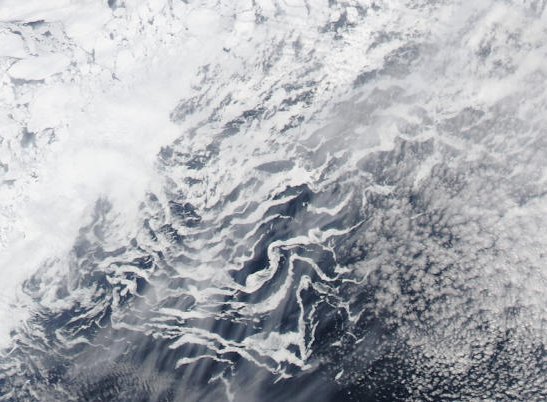
The water vapor coming from melting and fracturing ice commonly shows characteristic patterns. Strong surface winds can create characteristic parallel lines of ice smoke. In less windy conditions the freshly released water vapor creates chaotic eddy patterns, as shown in this image of ice in Baffin Bay.
The MODIS satellites have different channels which help pick out land, water, ice and cloud. Maps are available of seabed topography. Much is known about currents, density and salinity - a great part of it from data gathered by the U.S.A. and the U.S.S.R. during the cold war. When all of these tools are used together it is possible to see the Arctic as a dynamic, mobile entity: a giant heat engine.
Unfortunately NASA's MODIS site is currently having hardware problems. I had hoped to provide some of the latest 250m images. Instead, I shall describe what I intend to show using up-to-date images in a follow-up, once the MODIS images are available again. Here is the same mosaic as above, but annotated to show areas of interest.
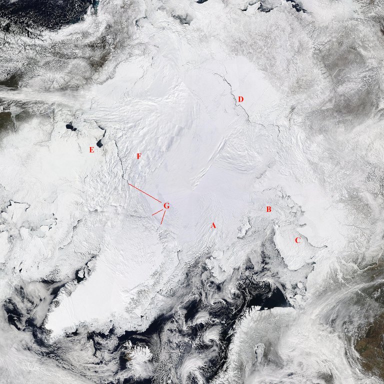
A - The area under the cloud is heavily cracked. It appears to be breaking up, which means that it will very likely be pushed to the South by prevailing winds.
B - The Kara Sea area is rapidly becoming ice-free. Once it is ice-free the adjacent land starts to lose ice and snow cover.
C - The sea between Novaya Zemlya and the mainland tends to trap ice until it is well fragmented and free-flowing. That ice is currently breaking up and will probably soon disperse. The reduced albedo in areas B and C will allow the waters to warm more, helping to thaw areas around Franz Josef Land and Svalbard.
D - An open lead is extending towards the Barents Strait area. Once the ice in the Barents Strait area is fragmented enough to disperse, this lead will probably begin to expand in width. Note that the Barents Strait is narrow. This, in combination with the many islands in the general area, slows down the rate of ice export to the South.
E - Passages from Baffin Bay through the various islands to the Beaufort Sea are showing signs of thaw. Closer examination shows some very young ice. The chances are high that the NorthWest passage will be open this year.
F - A large triangular area of ice is showing signs of breaking up. The open lead is about 10km wide in places. If it remains open, and especially if it expands, it will act as a conduit for the export of broken ice to warmer waters.
G - The three red lines point to the extent of leads either side of the Nares polynya. The Nares polynya is already exporting some ice from the Lincoln Sea, but the rate is reduced for as long as the Northern Baffin Bay area remains choked with ice. If the lead, which already extends from the Beaufort Sea to East of the Nares polynya, should extend fully to the Fram Strait, then ice loss would accelerate significantly as the ice is exported into the Fram Strait.
Edit: this article is continued in Interpreting Arctic Satellite Images And Data #2 - Animations
Credit:
all MODIS images are from http://rapidfire.sci.gsfc.nasa.gov/


Comments