

Now that NASA's MODIS rapid response system is back online I am able to present some animations which I hope you will find interesting.
This article is a continuation of Interpreting Arctic Satellite Images And Data.
There is a very neat trick which can be used to see if something has changed or moved between two images. If you can rapidly shift your gaze from one image to the other, blinking in between, the differences appear to jump around. If a picture is particularly grainy it helps to squint whilst blinking. Way back before computers were used to compare images, astronomers used a device called a blink_comparator to detect, for example, asteroids and comets by comparing photographs taken at intervals.
The technique is also useful in philately, where a minor difference between two postage stamps can mean a difference of value between a cent and a million greenbacks.
The blink comparison method is identical in principle to any method of showing two or more pictures in quick succession. To save you the eye strain that comes from blinking and squinting - not to mention strange looks from colleagues - I have prepared some animations.
In these animations you can get some idea of the motions of ice, the flow velocities and volumes. The general direction of ice is away from the pole, impelled by the prevalent winds. The animations will, I hope, serve to show where ice flow is impeded by the various islands and straits.
The first animation runs from February through April 27 2010, the date of this article. It shows how, soon after the 24 hour Arctic night has changed to 24 hour day, ice is fracturing, melting and moving. As ice is being exported from the Nares Strait, top right, the larger ice masses are moving slowly South. At the Southern extremes of this ice-jam, ice is being exported into warmer waters. A vast lead opens along Greenland's Western coast. Slowly, inexorably, the ice mass in Baffin Bay is shrinking. That would be perfectly normal, but in many places the amount of ice loss is what would be expected for May, not April.
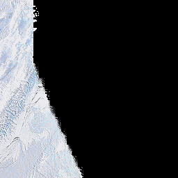
Ice in Baffin Bay, February through April 27 2010
The ice entering Baffin Bay is coming from the Lincoln Sea via the Nares Strait, or Nares Polynya. The waters of the Nares polynya are warmer than is normal for Arctic waters. It would be perfectly normal for ice to flow from the Lincoln Sea through the Nares Strait for two or three weeks in September. To the best of my knowledge, a significant flow of such ice through the Nares Polynya has never been recorded in April. The next animation shows ice movements in the area of the Lincoln Sea.
A triangular area of ice at the end of the Nares Strait is often fractured. Fragments of that ice are often exported for a few weeks into the strait. The ice heals in winter and the pressures exerted squeeze the ice into a small arch or small polynya extension which may, or may not freeze over during a specific year. The bulbous shape seen in the animation is residual from 2009 and is at least four times the area of what might be considered normal at any time. As the days go by, instead of a small fractured triangular area confined to the Lincoln Sea, the fractured area extends along the coast of Ellesmere Island.
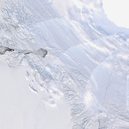
Ice in the Lincoln Sea and Nares Strait, March to April 27 2010.
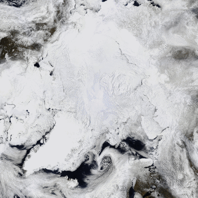
The final animation shows an overview of almost the entire Arctic. It serves, I hope, to place the previous animations into the wider context of the Arctic as a huge dynamic system.
These animations were prepared by me from NASA rapidfire images. In the first animation I have blacked out the night-time areas which in the original images were left blank. In some sequences I have left out images which showed mostly cloud cover. One frame which showed a white square, presumably due to data loss, has been patched with an area from an adjacent frame. I have also made moderate resizing adjustments. Apart from those edits, the images are as downloaded.
Larger versions of the individual images are freely obtainable courtesy of NASA and the U.S. taxpayer at: http://rapidfire.sci.gsfc.nasa.gov/
Related articles:
Interpreting Arctic Satellite Images And Data
Arctic Tipping Points - #4: The Broken Bridges Of Nares
Sermeq Kujalleq - Jakobshavn Isbrae Retreat


Comments