But, of course, we haven’t. Reading and writing is a recent human invention, going back only several thousand years, and much more recently for many parts of the world. We are reading using the eyes and brains of our illiterate ancestors. Why are we so good at such an unnatural act?
Here I describe recent evidence that, although we have not evolved to be good at reading, writing appears to have culturally evolved to be good for the eye. More specifically, recent research supports the exciting hypothesis that human visual signs look like nature, because that is what we have evolved over millions of years to be good at seeing. This ecological hypothesis for letter shape not only helps explain why we are such good readers, but answers the question, Why are letters and other visual signs shaped the way they are?
The Variety of Visual Signs
Given the tremendous variety of visual signs over human history, it may at first glance seem that there could be no simple answer to the question, Why are visual signs shaped as they are? After all, we have been making visual signs for at least 40,000 years, starting with tool decorations and cave paintings.
The evolution of ornamentation, art, painting, and other non-linguistic visual signs (i.e., signs not part of language) has gone on unabated, diversifying into millions of non-linguistic symbols used over the ages, and occupying nearly all aspects of our lives, including pottery, body art, religion, politics, folklore, medicine, music, architecture, trademarks and traffic.
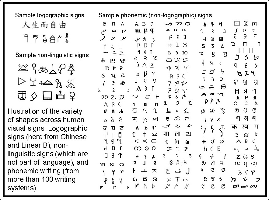
Click image for larger size.
Writing (i.e., visual signs distinguished by use as a means of visually recording the content of spoken language) has also undergone an evolutionary explosion in variety. The earliest writing appeared several thousand years ago, and occurred independently in Sumer, Egypt and China (and much more recently in the Americas). These earliest linguistic visual signs were pictograms, evolving later to logograms (where a character denotes an object, idea or action), and a single logographic writing system (such as Chinese or Linear B) can have many thousands of distinct visual signs.
It wasn’t until about 2000 years ago in Egypt that phonemic writing was invented and used, where each character stands for a constituent of speech rather than having a meaning as in logographic writing. Many hundreds of writing systems have evolved and diversified from this ancestor (e.g., Latin, Arabic, Avestan, Mongolian, Phags-pa), varying widely in geometrical shape and style, and in the aspects of speech the characters represent (e.g., alphabets represent consonants and vowels, abugidas represent just consonants, and syllabaries represent syllables).
Amongst both non-linguistic and linguistic signs, some visual signs are representations of the worlde.g., cave paintings and pictograms, respectivelyand it is, of course, not surprising that these visual signs look like nature. It would be surprising, however, to find that non-pictorial visual signs look, despite first appearances, like nature. Although writing began with pictograms, there have been so many mutations to writing over the millenia that if writing still looks like nature, it must be because this property has been selectively maintained. For non-linguistic visual signs, there is not necessarily any pictorial origin as there is for writing, because amongst the earliest non-linguistic visual signs were non-pictorial decorative signs. The question we then ask is, Why are non-pictorial visual signs shaped the way they are?
Previous efforts at answering this question have primarily concentrated on the differences. In particular, some of the shape differences among different (non-pictorial) visual signs are due to the kind of writing implement used, whether impressions in clay tablets with a blunt reed, rounded writing on leaves, or the physical details of a modified feather-tip point. Little attention has been devoted to uncovering the similarities, however, and as we will see here, there are deeper visual regularities that hold across human visual signs, independent of the writing mechanism (regularities that are also found in nature).
It is as if someone had noticed that throat size causes male and female voices to sound differently, without noticing that male and female speech possesses a critical deeper regularity, namely that they utter the same set of phonemes, morphemes, words and sentences as one another (within a single language speaking community). We will find that, despite superficial differences in their shapes, visual signs appear to possess similar underlying “visual phonemes.”
The Shapes of Visual Signs
Uncovering deeper visual regularities that might govern visual signs is crucial in any attempt to explain why visual signs are shaped as they are, and, in turn, to explain why we are so good at reading. After all, we cannot explain why visual signs are shaped as they are if we do not first determine how visual signs over history are, in fact, shaped! A difficulty in trying to find such regularities is that it is not straightforward to describe how even a single letter is shaped, for a single letter can undergo considerable distortion (e.g., from person to person, or from font to font) without losing its identity.
How can one hope to scientifically address the kinds of shapes found among visual signs, when it is awkward to even rigorously say what the shape of a single letter is?
To solve this problem I decided to use a topological notion of shape, where the details of the geometry do not matter, and what matters is only the manner in which strokes intersect, or join, with other strokes. A straight line, a C and an S have the same topological shape because each is topologically just a single stroke. L, T and X are the three distinct kinds of topological shape having two strokes. For example, a V has the same topological shape as an L because each consists of two strokes meeting at their endpoints.
This notion of shape will be helpful later in measuring the shapes of nature, because while geometrical shape can change quickly as a function of a person’s viewpoint, topological shape is more viewpoint invariant, providing a more robust characterization of the shapes in nature. This topological notion of shape is not merely useful, but possesses psychological justification as well: experts in psychology (e.g., Irving Biederman’s work on intermediate-level representations) and computer vision believe that our visual systems may represent shape in a topological manner.

In earlier research I had shown (along with my collaborator Dr. Shinsuke Shimojo) that letters have on average three strokes, and this average does not vary as a function of the number of letters in the writing system. Because of this, I considered topological shapes with three or fewer segments, in particular the 36 topological shapes that can be drawn with three straight lines (even though each topological shape covers curvy geometrical shapes as well). In addition to a single-stroke, and L, T and X, there are five three-stroke configurations having a single junction (i.e., a single point of intersection of the strokes) exemplified by Y, K and ψ. There are 11 configuration types having three segments and two junctions, exemplified by characters such as ] (or, equivalently, Z), 1, F, I, Π and ≠. Finally, there are 16 topological shapes with three segments and three junctions, such as Δ and A.
With these 36 kinds of topological shape primitive in hand, we (Dr. Shinsuke Shimojo, and two Caltech undergraduate students, Qiong Zhang and Hao Ye) set about rigorously measuring how common these shapes occur among visual signs. We began by measuring from three distinct classes of non-pictorial visual sign: phonemic writing systems (non-logographic), Chinese characters (logographic), and non-linguistic symbols. The set of phonemic letters were taken from about one hundred phonemic writing systems over history, and the topological shape of the entire letter was measured (if it was one of the 36 types in our repertoire). For Chinese characters and non-linguistic symbols, the signs typically have more than three strokes, and we measured all the topological shapes that occur as part of the whole sign.
What we discovered is that the shapes across these three very different kinds of visual sign are similar. For example, Ls and Ts are in each case common, but Xs rare. And across the 32 different kinds of topological shape with three segments, these three classes of visual sign highly correlate with one another. For example, Y's tend to be common relative to ∗'s, Z's and F's more common than 1's, and H's more common than Π's. That is, despite the seemingly unrestrained variability in shape among these visual signs, they in fact possess a similar topological shape “signature.” Now we are in a position to more meaningfully ask why visual signs are shaped as they are. Namely, why do visual signs have this signature?
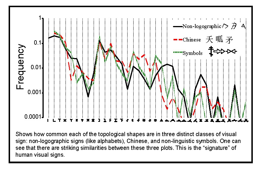
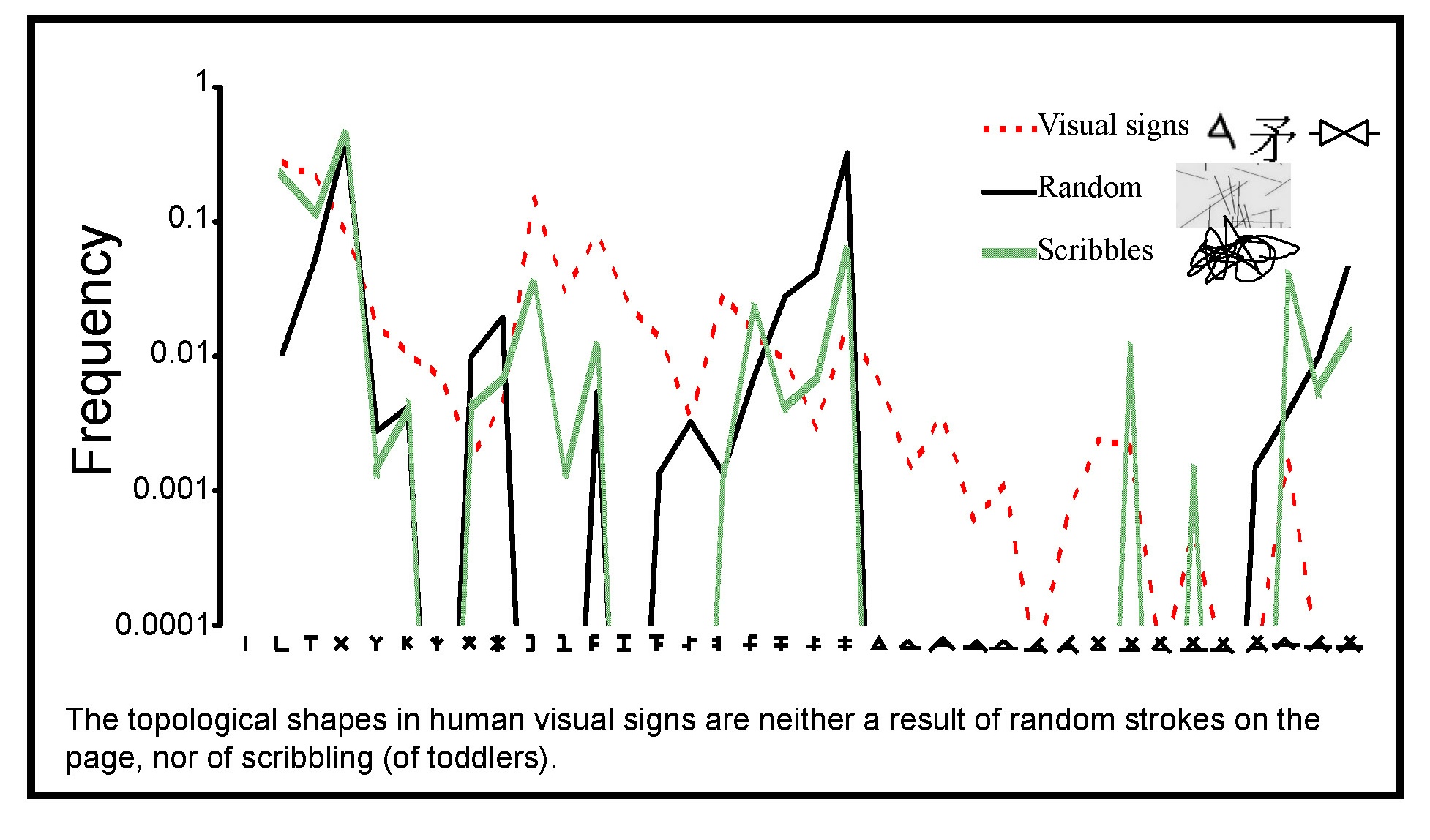
They don’t get this signature by chance. For example, if one were to randomly place strokes onto the writing surface, the most common two-segment topological shape would be X. T's would be rarer because they require a coincidental alignment of one endpoint along the edge of another. L's, in turn, are even rarer because they require the double-coincidence of two endpoints touching. Among the topological shapes with two or three junctions, the shapes with more X's will be more common in a randomly generated sign, and the shapes with more L's the rarest; e.g., ≠ is the most common topological shape with two junctions, and Z the least common.
This is not at all the case for the visual sign signature, where Ls and Ts are more common than X, and where, for example, ≠ is actually much rarer than Z. Another mechanism for the random generation of visual signs would be the act of scribbling, which is similar to the random-stroke case just mentioned, except that for scribbles Ls are now common, not rare. That is, for scribbles Ls and Xs are much more common than Ts, leading to a distribution of topological shapes unlike that of human visual signs.
Designed For Reading or Writing?
Thus far, we have seen that human non-pictorial visual signs appear to possess a characteristic signature, and we have seen that this signature is not a result of chance. Before attempting to explain this signature, a natural first question is, Does this signature appear to be good for the eye, or good for the hand (or any other writing mechanism)?
There are at least two reasons for expecting that visual sign shapes are designed (by cultural selection) for ease of reading, not ease of writing. First, visual signs are written once, but can be read many times. Second, writing speed is typically limited not by the motor system, but by the time taken for the writer to compose the sentence; that is, writing is not like talking, where we can talk effortlessly without feeling as if we are composing our thoughts.
Shorthand is an example kind of visual sign that violates both of these reasons—it is typically not read more than once, and it is written without the writer having to compose the sentences (instead, the boss is orally dictating). Accordingly, shorthand is designed for the hand at the expense of the eye. We measured the topological shapes across six different shorthand writing systems, and found that their topological shapes are radically different from that found in visual signs more generally.
In contrast, consider trademark logos, which are designed to be seen at the expense of being written (they are, in fact, typically not written at all). We discovered that trademark logos possess the same shape signature found in visual signs.
That is, when we look at signs we know are designed for the eye at the expense of the hand, the signature matches the general signature we saw earlier, but when we look at signs we know are designed for the hand at the expense of the eye, the signature is altogether different.
As further support for this, we found that the visual sign shape signature correlates well with the number of angles in the shape (a measure of visual complexity), but does not correlate at all with the number of hand motions required to write the topological shape (a measure of motor complexity).
Together this makes a strong argument that the topological shapes of visual signs have been selected for reading, not writing.

Natural to the Eye
The topological shapes of non-pictorial visual signs are, then, for the eye, not the hand. But we are still left with the question, Why does the eye like these shapes? Here is where the evolutionary, or ecological, hypothesis enters into the story. Because over millions of years of evolution our visual systems have been selected to be good at processing the conglomerations of contours occurring in nature, I reasoned that if visual signs have culturally evolved to be easy to see, then we should expect visual signs to have natural topological shapes.
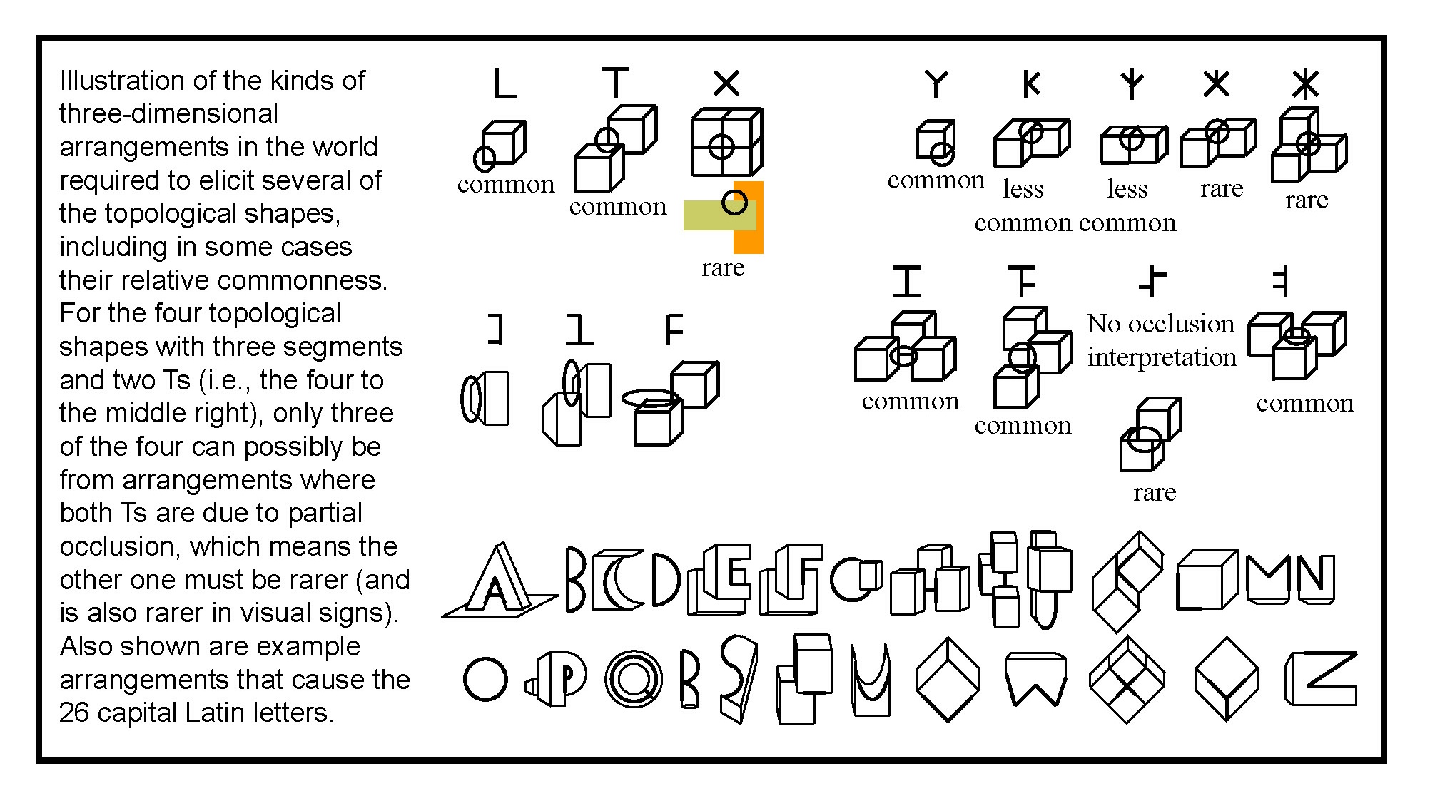
Where are these topological shapes in nature? What were conglomerations of strokes for visual signs are now conglomerations of contours for natural scenes. Contours are the edges of objects (as seen by the eye), not, of course, strokes in the world. For example, an L occurs in the world when exactly two edges of an object meet at their endpoints, like an elbow. A T occurs in the world when the edge of an object goes behind another object in the foreground. A Y occurs, for example, at the inside corner of a rectangular room.
We measured how common these and the other topological shapes occur in natural scenes, and were stunned to find that nature possesses the shape signature we saw earlier for visual signs. That is, visual signs are shaped like nature, confirming our ecological hypothesis for the shapes of visual signs.
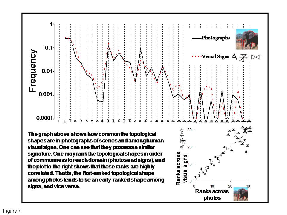
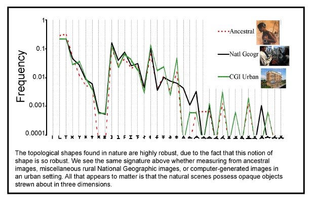
If visual signs look like nature, one might first suppose that the shape signature of nature depends significantly on which natural environment one considers. However, to our surprise, we found that the shape signature is highly robust, differing hardly at all whether we measured images of ancestral environments (e.g., tribal villages, savannas) or urban environments (buildings, walkways).
Because of the robust topological notion of shape we used in our analysis, any environment with opaque objects strewn about will tend to have the same shape signature.
This underlies why the diverse kinds of visual sign have a similar signature despite the diverse environments from which they spring, and one may speculate that aliens might for this reason possess visual signs that look reminiscent of our own.
We have been considering visual signs generally, but let us now specifically consider letters in phonemic writing system, for there is an additional question one might have about letters. We saw a moment ago that letters look like natural object junctions. Our ecological hypothesis expects letters to look natural, but why natural junctions? Why not have letters shaped like natural single contours? Or, alternatively, why not have letters shaped like whole objects? Instead of one stroke or a dozen strokes, letters in fact tend to have about three strokes (independent of the size of the writing system), and thus are at an intermediate level between edges and objects.
The answer may lie in the following pair of facts: (i) we wish to read words, not letters; and (ii) we have evolved to see objects, not object-junctions. In this light, we expect culture to select words to look like objects, so that words may be processed by the same area in visual cortex responsible for recognizing objects.
Logographic characters (e.g., Chinese) and non-linguistic symbols do tend to be more object-like, possessing many more than three strokes. For phonemic writing, however, there are severe limits to how closely words can match natural objects, for the manner in which letters combine is determined by speech. However, by having letters shaped like natural object-junctions—rather than natural contours or natural whole objects—written words become combinations of natural junctions, and thus more similar to objects and more easily processed by our visual system.
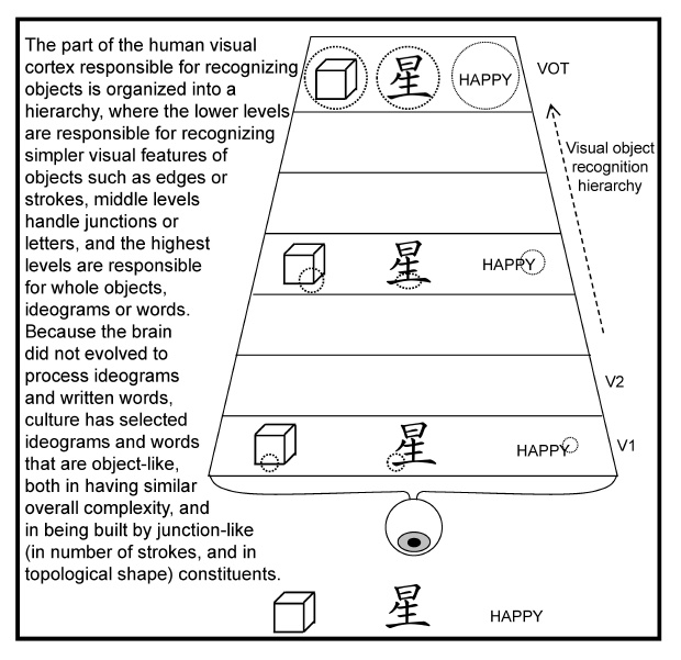
Evolution by natural selection is too slow to design our brains for reading, and so cultural selection has come to the rescue, designing (without any designer) visual signs for our brains. Because our visual systems have evolved to be good at perceiving natural objects, cultural evolution has created non-linguistic symbols, logographic symbols, and written words in phonemic writing that tend to be built out of object-junction-like constituents, and are thus object-like.
In particular, this explains why letters tend to have around three strokes and have the topological shapes they do. We expect that these insights will be useful in designing optimal alphabets or visual displays.
Because culture is capable of designing for the eye, the visual signs of our culture are a fingerprint of what our visual systems like. Akin to the linguistic study of the auditory productions humans make, the “visual linguistic” study of the visual productions people make is a currently under-utilized tool for vision research.
There is every reason to believe that the study of visual linguistics will aid traditional lab experiments on vision and brain design as much as linguistics has supplemented lab experiments on cognition.
Short Bibliography:
Biederman I&Cooper EE (1991) Priming contour-deleted images: evidence for intermediate representations in visual object recognition. Cognitive Psychology 23: 393–419.
Changizi MA&Shimojo S (2005) Character complexity and redundancy in writing systems over human history. Proceedings of the Royal Society of London B 272: 267-275.
Changizi MA (2006) The optimal human ventral stream from estimates of the complexity of visual objects. Biological Cybernetics 94: 415-426.
Changizi MA, Zhang Q, Ye H & Shimojo S (2006) The structures of letters and symbols throughout human history are selected to match those found in objects in natural scenes. The American Naturalist 167: E117-E139.
Changizi MA (2009) The Vision Revolution (Benbella Books, Dallas).
Daniels PT & Bright B (1996) The World’s Writing Systems. New York: Oxford University Press.


Comments