

This article describes the current state of the Arctic sea ice and makes some predictions for the month ahead. The predictions are based on my visual analysis of hundreds of satellite images.
I begin with some background and explanatory materials and then show how satellite images can be analyzed to show the mechanisms of ice consolidation and fracture. In the concluding part I show some images of the Arctic ice at the time of writing and point out what I think will happen to that ice during this month.
It is one thing to feed a stream of data into a computer and output a map or graph, but quite another to make use of the finest instrument known to science: the Mark 1 eyeball. To be entirely fair to the many scientists engaged in Arctic studies, they do not have the budgets to pay for the man-hours needed to analyze hundreds of images daily. I, on the other hand, being unable to do much physically, delight in studying those images for hours at a time.
This article follows on from Arctic Ice May 2010 and Arctic Ice May 2010 - Update.
In the first of those articles I wrote:
I have no doubt that by the end of this month, May 2010, there will be much less sea ice than there was in May 2007.
I have no doubt either that the anti-science propagandists will continue to insist either that the ice is recovering or that Arctic melt is perfectly normal.
I claim that I was right on both counts. Visible spectrum satellite images show a substantial reduction in both the quantity and quality of sea ice. I shall shortly explain what I mean by those two terms. As to people denying Arctic melt, or denying that it is unusual, there are actually few global warming deniers wishing to stick their necks out. I have already written about a pair of propagandists in Desperately Denying Arctic Warming. Meanwhile, others are trying desperately to pick holes in graphs. Lord Monkton makes very artistic use of graphs. But why look at graphs when you can look at the actual ice? That said, I shall start with some graphs.
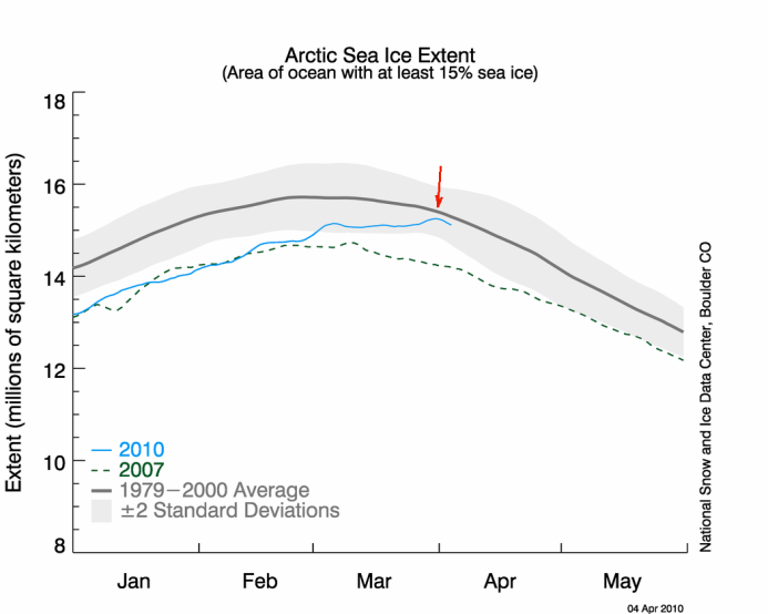
Here is the graph from April 04 2010 that had some bloggers and media talking of Arctic sea ice recovery, but which I discounted as a minor blip:
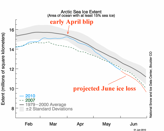
This next graph shows ice extent as of June 01 2010 with my annotations in red. My projection for June ice loss is based on the current state of the entire Arctic ice and on past regional loss rates. I consider my projection to be, if anything, over-optimistic.
The above graphs showing ice extent were sourced from the National Snow and Ice Data Center
http://nsidc.org/arcticseaicenews/
The next graph shows ice volume anomalies as for June 02 2010. I have reduced the image size, but it is otherwise unaltered. The image is sourced from the Polar Science Center
http://psc.apl.washington.edu/ArcticSeaiceVolume/IceVolume.php
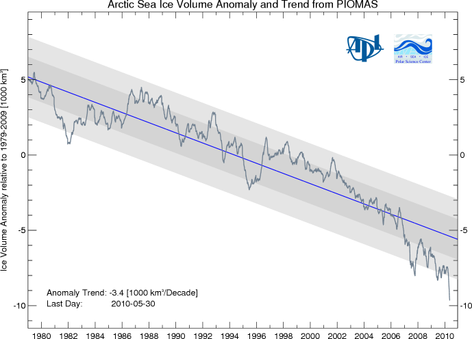
Whatever the reliable source of data, the year-on year trend is comparable: Arctic sea ice is shrinking. Short-term trends of a few days or weeks in graphs can be discounted. Trends in actual ice loss in Arctic summer can, however, be treated as regional weather trends within the larger Arctic region. The reason should be clear: ice which has melted in summer will almost certainly not re-freeze until the approach of winter.
The Polar Science Center explains the purpose in plotting sea ice volume as follows:
The purpose of this page is to visualize recent variations of total Arctic Sea Ice Volume in the context of longer term variability. Arctic Sea Ice Volume is an important indicator of climate change because it accounts for variations in sea ice thickness as well as sea ice extent. Total Arctic sea ice volume cannot currently be observed continuously. Observations from satellites, Navy submarines, moorings, and field measurements are limited in space or time. The assimilation of observations into numerical models, currently provides one way of estimating sea ice volume changes on a continuing basis.
Sea ice quantity and quality
For purposes of showing past trends it hardly matters what is being measured, as long as the method remains consistent year - on - year. But ordinary quantitative measures of ice do not readily lend themselves to predictive modelling. Sea ice is not a simple and uniform material. It is more like a matrix of aggregate and cement. Like many materials, when ice fractures, small particles prevent perfect closure of the fracture. In winter, every fracture in the ice, large or small, is bridged, if at all, with fresh ice. Fresh sea ice is salty ice. Salty ice is weaker ice. Normal build-up of sea ice rejects salt into the ocean below the ice. If the mass of old and new sea ice is not consolidated by the actions normal in the Arctic in winter then the fractures will remain weak.
Quantification by area, extent or volume does not model the weak points in the ice - the points where the ice will melt, fracture, spread out and thence either melt slowly as bits in situ or be dispersed into warmer waters where melt is more rapid.
The quality of sea ice may be considered as a set of engineering materials properties. Ice is weak in shear, that is why thin ice is easily punctured by a human foot. Ice is weak in tension. This shows up when a shore-fast ice sheet is subjected to a strong offshore wind or current. The ice fractures at the shore, producing a shore lead.
When large ice floes move around in water which is freezing over, the ice between the floes tends to become a mix of bits of ice all frozen together. A mixture of thicker and thinner floes frozen into a sheet is called an ice mélange, adapting a term from geology. Typically, the largest floes in a mélange show a top surface pattern of fissures matching the ice tongue from which they calved.
Ice melange, from Jacobshavn glacier tongue, to right.
A variety of ways in which sea ice can fracture and re-freeze is shown in the next images. If fractures are relatively uncompressed they tend to show as shades of grey in true color images. Where sheets of ice are compressed together compression ridges form. These are thicker than the sheets, more compact and more free of salt. The ridges show as white lines against bluish ice. Note that the color patterns of the ice mirror the albedo patterns. It is often possible to predict in the short term where the ice will fracture next.
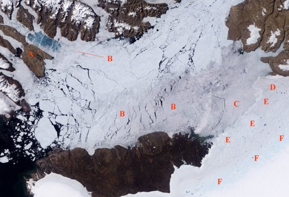
Ice in Kane basin, Nares Strait, August 2007.
A - blue color of water shows through thin ice, white lines are thick, compressed ice.
B - thicker ice separated by recently frozen thinner ice.
C - compacted and re-frozen fragments at least 1 year old.
D - Humboldt glacier tongue calving point.
E - Humboldt glacier, ice fairly immobile, apparently grounded.
F - margin of coastal melt zone with moulins.
.
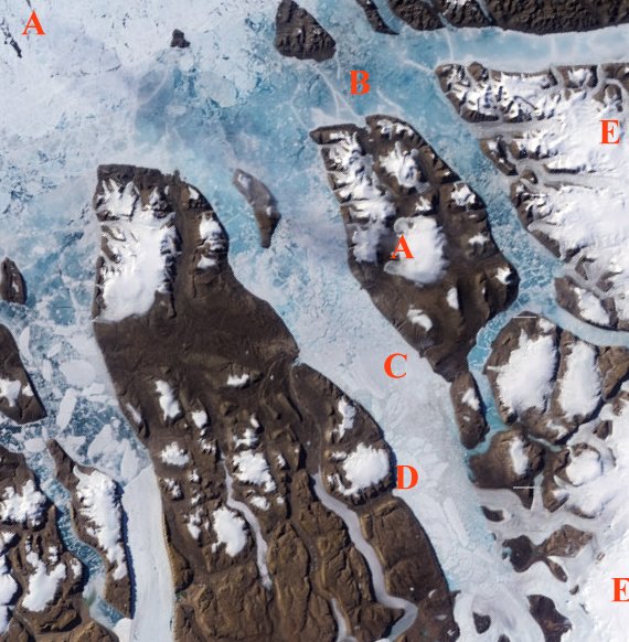
Detail near location of image above, August 2007.
A - A shows a line of grey cloud.
B - blue color of water shows through thin ice, white lines are thick, compressed ice.
Some blue areas also have melt pools above the ice.
C - ice type B blends into type D.
D - thicker ice separated by recently frozen thinner ice.
E - ice caps and ice sheet.
Images sourced from an 'image of the day' for August 30 2007:
http://earthobservatory.nasa.gov/IOTD/view.php?id=7999
Discrimination problems
There are two problems with using computer analysis and modelling of sea ice. The first is a problem of measurement, the second a problem of identification.
Ice thickness measurements take a sea level datum and measure the height of the ice above datum. The problem with this method is that the ice is 9/10ths submerged. Any error margin in measuring the ice height above datum may be taken to be 9 times that error below water. Data publishers need to make clear whether their error bars apply to the directly measured height or the computed thickness. If the error margin is not carefully specified then it would not be unreasonable for anyone to assume that it is the above-datum error only - and allow for a larger-than-published error.
The problem of identification is a problem of determining exactly what a satellite is recording. As can be seen in the two images above, there can be subtle changes across ice types which might lead to errors in determining sea ice extent. There is also the problem of coastal contamination - a situation where land ice is seen as sea ice and vice versa. Allowances are made for such problems in data analysis and modelling, but direct observation - preferably at ground level - gives far greater accuracy.
Recent Arctic sea ice images
The most recent ice extent map from NSIDC is shown below, followed by detail images from MODIS satellites which highlight some of the regions in the map.

Sea ice extent June 02 2010
Image source:
http://nsidc.org/arcticseaicenews/
.
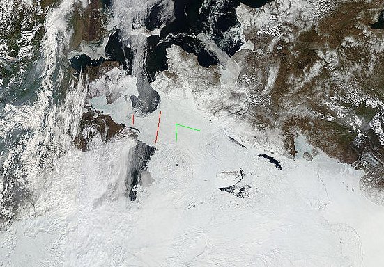
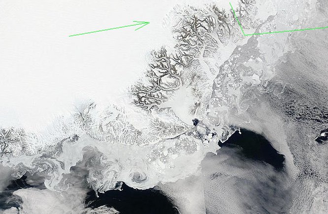
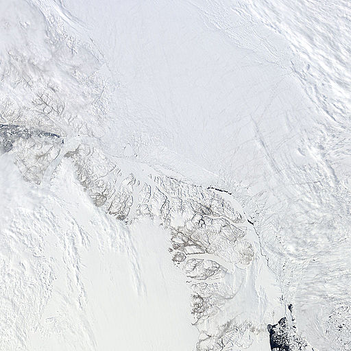
May 31 2010 Bering Strait area.
The ice between the red lines is now open water, but is not readily visible in more recent images due to cloud cover. The two areas indicated by the green lines are areas of broken and mobile ice. The Beaufort Sea, linked in my final image below, is off-image at bottom left.
.
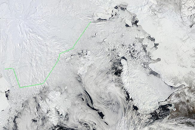
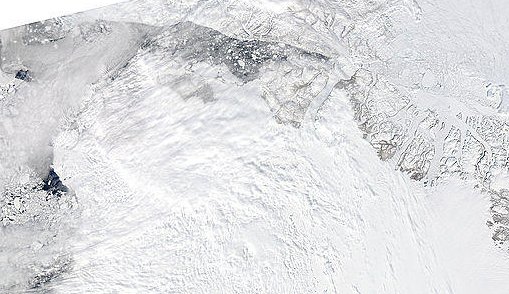
May 31 2010 - Greenland - Svalbard - Franz Josef - Novaya Zemlya
The green line shows the approximate limit of continuous ice. Ice south of the line is highly fragmented and mobile.
.
June 03 2010 - Franz Josef Land and Novaya Zemlya
There is little ice in the Barents Sea area shown here. The ice at the top of the image is highly fragmented and mobile. In the Kara Sea between Novaya Zemlya and the mainland the ice is highly fragmented but trapped, with only a small strait as outlet.
.
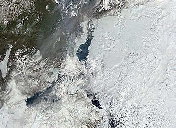
June 03 2010 - Greenland Sea Scoresbysund / Ittoqqortoormiit.
Apart from the small area indicated by green lines, there are few large floes left along the coast. Dense ice-smoke and cloud indicates that some ice is still melting in the area, but it is much less than the 25% extent indicated by the NSIDC map.
.
June 03 2010 - Baffin Bay.
The Jacobshavn glacier is arrowed. Under the heavy cloud is open water. The main body of pack ice can be seen clearly towards the top of the image. To the south of Davis Strait - off image - the water is very much open and ice free.
.
June 03 2010 - Nares Strait.
The Nares Strait remains open. Ice is channeled from the Lincoln Sea, right, to Baffin Bay, left, melting along the way in the warm currents of the Nares Strait
.
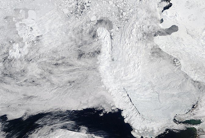
June 03 2010 - From Lincoln Sea to Fram Strait.
The entire Lincoln Sea area remains highly fragmented and mobile, but this fact is obscured by hazy cloud. The highly fragmented area at right continues to lose fragments into the Fram Strait, bottom right. The two areas of fragmented ice are connected by a strip, approximately 10 miles wide of highly fragmented coastal ice. That strip is mainly pressed inshore, but leads develop frequently and the ice appears to be drifting mainly towards Fram Strait.
.
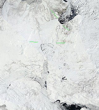
May 31 2010 - North West Passages.
The ice between Parry Channel and McClure Strait - between the melt fronts indicated by the green lines - has persisted for some time. It is likely, in my opinion, that opposing tides or currents have caused a consolidation here as an ice bridge. Until that ice is gone, the movement of ice fragments in the channels will be very restricted. I expect more melting in this area over the next month, but expect the ice bridge to remain for about 2 to 4 weeks more.
.
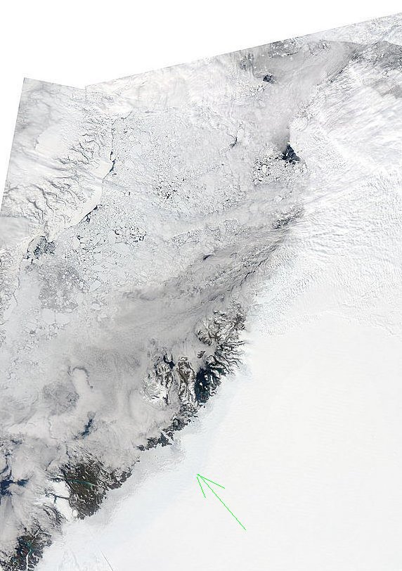
May 31 2010 - Beaufort Sea.
From the McClure Strait we proceed into the Beaufort Sea. The lobe of open water at left is the Amundsen Gulf. It leads into the two still frozen routes around Victoria Island. Cloud at top right continues to obscure the ice. Much of the ice under that cloud is highly fragmented. It connects to the Bering Strait.
Discussion
In estimating what will happen in the Arctic short-term, I suggest we should first try to determine the mobility of ice in a given area. If ice is highly mobile and likely to soon enter warmer waters then discussions of its thickness or age are somewhat moot.
In order to determine if ice is likely to become mobile any time soon, we should try to estimate its past and current degree of fragmentation and re-consolidation.
--------------------------------------------
.
Credit: all of the Modis images used here are courtesy MODIS Rapid Response System -
http://rapidfire.sci.gsfc.nasa.gov/
I hope to post an update to this article in about 2 weeks, or sooner if anything special happens.
Related/recommended reading:
http://www.sciencecodex.com/recent_arctic_warming_reverses_millennialong...
http://www.montrealgazette.com/retreat+Arctic+worst+thousands+years+Stud...


Comments