

The subject is one of the topics which takes the most time away in discussions which arise during talks at internal meetings of HEP experiments. Physicists in the audience will be always happy to compare their ability of eye-fitting and to argue about whether there's a bump here or a mismodeling there. It is just as if we came with a built-in "goodness-of-fit" co-processor in the back of our mind, and that was connected with our mouth without passing through those other parts of our brain handling the "think first" commandment. We do lose a lot of time in such discussions.
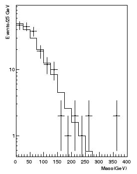 I am not overstating it: it happens day in and day out. For instance, it happened at a meeting I attended to yesterday. We were approving a physics result and somebody started arguing that most of the data points were above the fit in a certain region of the money plot of the analysis. This turned out to be false: in the specific case, the questioner was forgetting to take into account bins where the data had fluctuated down to zero entries: the histogram had a logarithmic y scale, which made those points disappear from the horizon below the lower edge of the plot. (The histogram on the right is taken from the paper described here and is a hypothetical one, so it has nothing to do with the episode I am mentioning!)
Besides the issue of deceiving zero-entry bins, there are several other reasons why one should be careful with such eyeballing comparisons, but by far the most important one is that the data, when they consist in event counts per bin, are universally shown as points with error bars, and the error bars by default are drawn symmetrically above and below the observed count, and extend from N - sqrt(N) to N + sqrt(N), if N is the bin content. In other words, the default is to use the fact that the event counts, being a random variable drawn from a Poisson distribution, has a variance equal to the mean.
Here I should explain to the least knowledgeable readers what is a Poisson distribution. Any statistics textbook explains that the Poisson is a discrete distribution describing the probability to observe N counts when an average of m is expected. Its formula, P(N|m)=[exp(-m)* m^N]/N! (where ! is the symbol for the factorial, such that N!=N*(N-1)*(N-2)*...*1, and P(N|m) should be read as "the probability that I observe N given an expectation value of m").
So what's the problem with Poisson error bars ? The problem is that those error bars are not representing exactly what we would want them to. A "plus-or-minus-one-sigma" error bar is one which should "cover", on average, 68% of the time the true value of the unknown quantity we have measured: 68% is the fraction of area of a Gaussian distribution contained within -1 and +1 sigma. For Gaussian-distributed random variables a 1-sigma error bar is always a sound idea, but for Poisson-distributed data it is not typically so. What's worse, we do not know what the true variance is, because we only have an estimate of it (N), while the variance is equal to the true value (m). In some cases this makes a huge difference.
Take a bin where you observe 9 event counts and the true value was 16: the variance is sqrt(16)=4, so you should assign an error bar of +-4 to your data point at 9. But you do not know the true value, so you correctly estimate it as N=9, whose square root is 3. You thus proceed to plot a point at 9 and draw an error bar of +-3. Upon visually comparing your data point (9+-3) with the expectation from a true model, drawn as a continuous histogram and having value 16 in that bin, you are led to believe you are observing a significant negative departure of event counts from the model, since 9+-3 is over two "sigma" away from 16; 9 is instead less than two sigma away from 16+-4. So the practice of plotting +-sqrt(N) error bars deceives the eye of the user.
Worse still is the fact that the Poisson distribution, for small (m<50 or so) expected counts, is not really symmetric. This causes the +-sqrt(N) bar to misrepresent the situation very badly for small N. Let us see this with an example.
Imagine you observe N=1 event count in a bin, and you want to draw two models on top of that observation: one model predicts m=0.01 events there, the other predicts m=1.99. Now, regardless of whether m=0.01 or m=1.99 is the expectation of the event counts, if you see 1 event you are going to draw a error bar extending from 0 (i.e., 1-sqrt(1)) to 2 (1+sqrt(1)), thus apparently "covering" the expectation value in both cases; but while for m=1.99 the probability to observe 1 event is very high (and thus the error bar around your N=1 data point should indeed cover 1.99), for m=0.01 the probability to observe 1 event is very small: P(1|0.01)=exp(-0.01)*0.01^1/1!=0.01*exp(-0.01)=0.0099. N=1 should definitely not belong to a 1-sigma interval if the expectation is 0.01, since almost all the probability is concentrated at N=0 in that case (P(0|0.01)=0.99)!
The solution, of course, is to try and draw error bars that correspond more precisely to the 68% coverage they should be taken to mean. But how to do that ? We simply cannot: as I explained above, we observe N, but we do not know m, so we do not know the variance. Rather, we should realize that the problem is ill-posed. If we observe N, that measurement has NO uncertainty: that is what we saw, with 100% probability. Instead, we should apply a paradigm shift, and insist that the uncertainty should be drawn around the model curve we want to compare our data points to, and not around the data points!
If our model predicts m=16, should we then draw a uncertainty bar, or some kind of shading, around that histogram value, extending from 16-sqrt(16) to 16+sqrt(16), i.e. from 12 to 20 ? That would be almost okay, were it not for the asymmetric nature of the Poisson. Instead, we need to work out some prescription to count the probability of different event counts for any given m (where m, the expectation value of the event counts, is not an integer!), finding an interval around m which contains 68% of it.
Sound prescriptions do exist. One is the "central interval": we start from the value of N which is the nearest integer to m smaller than m, and proceed to move right and left summing the probability of N+1 and N-1 given m, taking in turn the largest of these. We continue to sum until we exceed 68%: this gives us a continuous range of integer values which includes m and "covers" precisely as it should, given the Poisson nature of the distribution.
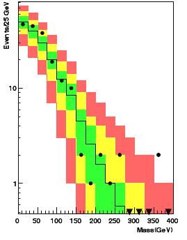 Another prescription is that of finding the "smallest interval" which contains 68% or more of the total area of the Poisson distribution for a given m. But I do not need to go into that kind of detail. Suffices here to point the interested reader to a preprint recently produced by R.Aggarwal and A.Caldwell, titled "Error Bars for Distributions of Numbers of Events". The paper also deals with the more complicated issue of how to include in the display of model uncertainty the systematics on the model prediction, finding a Bayesian solution to the problem which I consider overkill for the problem at hand. I would be very happy, however, if particle physics experiments turned away from the sqrt(N) error bars and adopted the method of plotting box uncertainties with different colours, as advocated in the cited paper. You would get something like what is shown in the figure on the right.
Note how the data points can now be immediately classified here, and more soundly, according to how much they depart to the model, which is now not anymore a line, but a band giving the extra dimensionality of the problem (the model's probability density function, as colour-coded by green for 68% coverage, yellow for 95% coverage, and red for 99% coverage). I would be willing to get away without the red shading -68% and 95% coverages would suffice, and are more in line with current styles of showing expected values adopted in many recent search results (the so-called "Brazil-bands").
Despite the soundness of the approach advocated in the paper, though, I am willing to bet that it will be very hard to impossible to convince the HEP community to stop plotting Poisson error bars as sqrt(N) and start using central intervals around model expectations. An attempt to do so was made in BaBar, but resulted in a failure -everybody continued to use the standard sqrt(N) prescription. There is a definite amount of serendipity in the behaviour of the average HEP experimentalist, I gather!


Comments