In December an important climate change meeting will take place in Copenhagen, Denmark: The United Nations Climate Change Meeting or the so-called COP15 climate meeting. It has been all over the media for quite some time already, with an intensified flow of information about both politics and climate change science as we approach the date when the meeting starts; 7th December 2009.
For scientists and readers of science there are questions of expressing and understanding the information related to climate change. If we put the quality of science aside and just assume that the results are based on sound scientific methods and as correct as one could possible achieve with the information and technologies available, there are the questions of communicating it for the scientists and understanding it for scientists from other fields of science, politicians and the general public.
The UN has an organization responsible for producing aids for communication, namely maps and charts. UNEP Grid-Arendal does this with great success. If there is anything I've learned from being active in the new media (science 2.0) it is that visualizations are gold. More than that, there is no way to go around using images, illustrations, graphics etc. It is the language we all understand. The problem with us working without an equivalent of a UNEP Grid-Arendal serving our organization, is that we have neither skills nor the resources in terms of time to develop a professional communication strategy nor learn and produce that kind of magic.
As a next best solution we borrow from those who have produced maps and graphics, but seldom do we find precisely that that would illustrate our results or points as we wish. Actually, it is hard to define what exactly we need.
For those scientist who have results relevant for the forthcoming meeting in Copenhagen, now is the time to share it with the rest of us. And now is perhaps the time to develop a strategy for communication and produce a few new maps and charts tailored for your angle or take on the climate change issue.
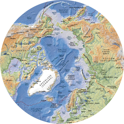
This map of the Arctic was made by cartographer Hugo Ahlenius when he worked for UNEP Grid-Arendal. Find out more about it here.
One of the excellent cartographers working for UNEP Grid-Arendal recently started his own company, Nordpil. I have to say that he is one of my favorite modern cartographers, mainly because he understands that maps are meant to be pieces of art, as opposed to the Google Earth products who are unnecessary ugly however useful the tool is, but also for his serene and elegant style. Anyways, he is responsible for a workshop for scientists who need a strategy or training in defining the above mentioned magic material to communicate the super duper interesting and important scientific results you have in your drawers.
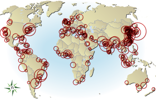
Graphic produced by cartographer Hugo Alhenius for a UN report about Natural resources and poverty. It elegantly and quickly illustrate the link between economy and natural resources.
Go indulge yourself with a workshop in Europe, either in Brussels 10th November 2009 or in the city where all the climate change action will take place in December, in Copenhagen 4th December 2009.
I'm sure it'll be fun, useful and you'll get an opportunity to enlarge your network.
Who'd want to go to Copenhagen in December (other than the COP15 meeting)? I would. That is mainly because Copenhagen is a great city year round, but in December they have something very special, namely the Christmas decoration of Tivoli 20th November - 30th December. Tivoli is one of Copenhagen's major attractions and before Christmas it is really the most romantic place on Earth. It is like one of Hans Christian Andersen famous fairy tales. Just had to tell you that, Scandinavian as I am. :-)
Hugo Ahlenius, Nordpil



Comments