

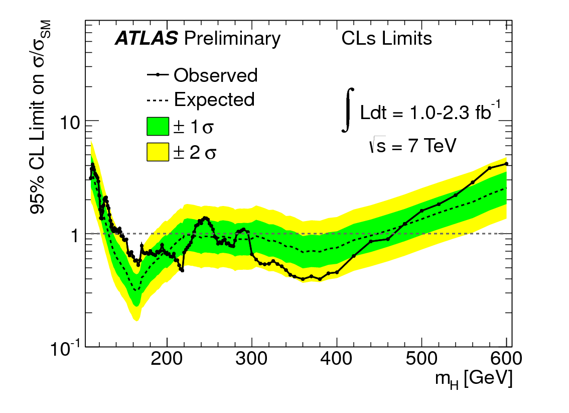
So let us jump to the money plot: the combined limit produced by ATLAS by putting together information from a dozen search channels, which employ from 1.0 to 2.3 inverse femtobarns of proton-proton collision data at 7 TeV centre-of-mass energy (the range is due to some analyses taking longer to be produced than others). The relevant figure is shown below.
 And a blowup of the low-mass region is in the following figure:
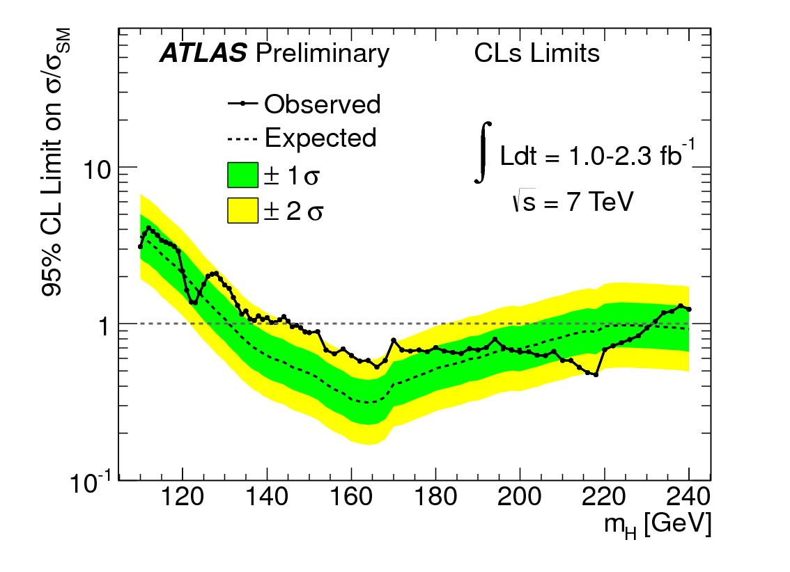 As always, this "Brazil band" plot shows the upper limit in the Higgs boson production rate, obtained by observing that no signal stands out in the data, and thus placing a limit in the number of possible Higgs boson decay events may be still hidden there without being detected. The limit which is obtained is the black curve, and it should be compared to two different things: one is the horizontal line at 1.0, which represents the production rate that the Higgs boson should have in the Standard Model, given the particular mass hypothesized for it.
 In other words, if I imagine that the Higgs exists and it has a mass of 200 GeV, then the Standard Model predicts that its production rate is X; if my analysis says that the production rate is instead observed to be less than Y, the black line will be located, for the horizontal tick mark at 200 GeV, at a value Y/X. The limit is thus plotted in units of "times the Standard Model predicted rate". By comparing the black curve with the horizontal line at 1.0, one can visually say where the data is incompatible with the existence of a Standard Model Higgs: when the black curve goes below 1.0 the respective mass value is "excluded", at the given confidence level (95%). Mass values for which the black curve is above 1.0 are instead ones which still are possible, given the data.
The other important feature of the figure is the Brazil band: this represent a range of possible values that the black limit curve could have taken. The width of the curve thus represents the possible outcomes of the experiment, given statistical fluctuations into account, if the Higgs boson does not exist (for each particular mass value). One can therefore gauge how much the data is in accord with the pre-data predictions of the experimental sensitivity (which are based on the details of the search procedures): if the actual limit curve is much above the Brazil band for some mass point, one can start to wonder whether the departure is due to the fact that a Higgs boson may indeed be contributing to the data in that mass range. If, however, the black curve goes significantly below the band, this only points in the direction of a badly overestimated background, such that there is an observed deficit of data for searches of the Higgs boson in that mass range.
Sorry for taking this long to explain the graph: there is indeed a tremendous amount of information in it. If you go back to it and check where the black line goes below 1.0, you see that ATLAS excludes Higgs boson masses above 145 GeV, and out to 466 GeV (apart from a couple of points in-between, which are however excluded by a previous CMS search if I'm not mistaken). You also see that the limit is two-sigma above the prediction (the edge of the upper yellow band) for Higgs masses in the 140-160 GeV range. But while the 160 GeV mass point is really excluded (the black curve is much below the line at 1.0), the 140 GeV point is not excluded.
A real Higgs boson of 140 GeV mass would indeed produce a visible upward fluctuation in the number of observed events, so the data is not totally incompatible with that hypothesis; however, one would see a larger effect. This is explained graphically in the following, very informative, graph.
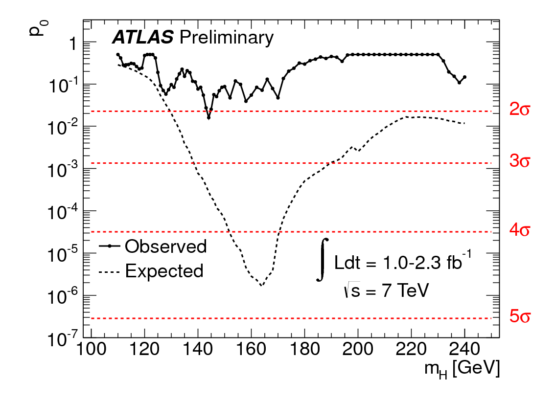
On the x axis there still is the tentative Higgs mass; on the y axis there are two curves: one is the p-value of the compatibility of data and expected backgrounds (full black curve), the other is the median p-value that would be observed by the combined searches in ATLAS IF THE HIGGS BOSON WERE THERE (dashed curve). You can therefore check (but alas, only qualitatively, since ATLAS does not give 1-sigma width information to its dashed curve) how much the observed "deviation" at 140 GeV is compatible with the existence of a 140 GeV Higgs: one sees that if the Higgs has really a mass of 140 GeV, ATLAS has been very unlucky, since it was expecting to be able to find an excess with a significance of over three standard deviations, while they got only about two.
With two standard deviations you don't really go anywhere nowadays... So the opinion I stated just a month ago seems correct after all: back then, using half the data and combining information from CMS and ATLAS, many were claiming that the strength of the 140 GeV tentative signal was close to four sigma, but I was warning everybody that that conclusion was unsupported by the data, given some caveats and the look-elsewhere effect. Another fluke headed to the cemetery.
Mildly more interesting, in my opinion, is the "excess" at 125-130 GeV (see again the graph above), where the significance is really much lower, but it is really in the ballpark that ATLAS would expect to see if the Higgs were there: in other words the full black curve and the dashed one are almost coincident there. What to say -we'll see by the end of 2011 if this, too, is just a fluke !


Comments