

In this second part of the article, I wish to consider a few other kinds of histograms, which instead of reporting relative frequencies are used to report the value of a quantity of interest (usually on the vertical axis, although exceptions abound) as a function of a variable which may be continuous, integer, or categorical. [Note: for the sake of this post, but also in real life, I tend to gloss over the distinction, also made by wikipedia, between histograms and bar charts, but strictly speaking they are right and I'm wrong - when the variable is categorical the graph does not allow any "density estimation" based on the reported data, as the categorical descriptor cannot be a basis for integration.]
It is easy to misunderstand these graphs if our intuition on its contents do not align well with the intent of its creator. I will make this point more evident below, using again a few random examples picked from the web or from physics articles.
Let us start with something simple, to set the stage. In the graph below, a set of estimates of a physical quantity (the mass of the W boson) are reported, along with their uncertainties.
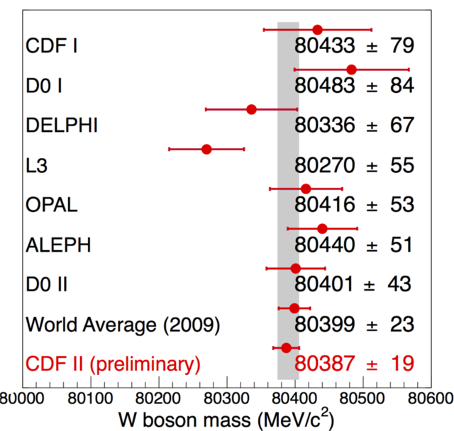
As you can see, this does not really look like a histogram, and yet it basically still is one, provided you appreciate a few facts. First, the "typical" setup of readings on the y axis and categories on the x axis is here subverted - the categories are on the vertical axis and the readings are on the horizontal one. Second, there are no histogram bars, just points with uncertainties, but the graph still qualifies as a histogram, as there still are virtual (not shown) "bars" extending from the left to the location of each point.
What is your reaction when you see the above figure? You likely realize at a glance that its purpose is to list different determinations (with the name of the various experiments) of the quantity reported on the x axis (W boson mass, in MeV/c^2). However, if you are unfamiliar with the reported units (masses in MeV/c^2) you start looking around for more cues: the scale only goes from 80000 to 80600, so it is both zero-suppressed and highly zoomed in. Then you also read in the reported numbers (one per each data point) and you realize that the reason the zooming was chosen was that all measurements fall within a very narrow interval. But otherwise, there is little left for imagination, and the graph is rather clear even to newbyes.
Let us check a few of the details. One of the reported determinations is in red, to highlight it. It should be evident that this graph in fact is produced by the CDF II collaboration, and its purpose is to compare their latest-gratest measurement of the W boson mass (a very important parameter of the standard model of particle physics) to previous determinations.
CDF II indeed puts next to its measurement the "world average", which is supposedly the result of taking the weighted average (correlations accounted for) of all the determinations in rows 1 to 7, explicitly to show that it is a groundbreaking measurement they are reporting, one which significantly improves over the combination of all previous measurements (in fact, the CDF II measurement has a reported uncertainty of 19 MeV, which is almost 20% smaller than the previous world average, and less than half the one of its most precise competitor, D0 II).
One final detail you need to take in, when you look at the above graph, is the meaning of the vertical grey bar. What is that bar doing there? We cannot know for sure by only considering the graph, and this information alone disqualifies a little the graph as a carelessly produced one. In a careful graph all the information required to make sense of its contents is available in the form of a legend or other provided text. Here, though, we are left wondering. I think the bar indicates the result of indirect electroweak fits, which at the time the graph was produced (2009) were already very precisely pointing to the most likely value of the W mass (and the top quark and Higgs mass, too, as the three quantities are tightly related in the standard model). Anyway, this is too much detail for this post. What matters is that by analyzing each bit of information in the graph we have produced a fairly good intuition of what the graph really reports, what it was meant to convey (the agreement with theory, the importance of the CDF II result), and we can walk alone with a feeling of accomplishment.
Let us consider now a second graph, still of the "histogram under disguise" kind, and one which made headlines recently. After the above discussion, it should be much easier for even the non-introduced to grasp the essence of the figure below.
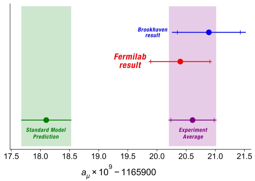
This graph is similar to the W mass histogram above, but is it too a histogram (or, okay, a bar chart)? One might start to lose connection to the concept, and be in need to repeat to oneself that a histogram (or bar chart) is essentially a graphical tool to compare values in different categories or as a function of some quantity, by putting each in a different "bin". Again, bins here run horizontally, and the quantity displayed is not even easy to spell - it's a function of a non-better-defined "a_mu" parameter. And again, the x axis is zero-suppressed, something which usually is to be frowned upon (lots of deceptive material exploits the trick of arbitrary zooming in on a region of the parameter space, but here, as before, it is only due to the need of considering a very small range of values).
The graph above only reports two measurements (on the top part), and their statistical combination (the pink point with uncertainty, and associated pink band). Further, a comparison is made to the green band that represents the theoretical "Standard Model Prediction" range of the measured parameter. As such, it is clear and hard to misinterpret. Yet it contains (and hides) detail which can be overlooked by distracted users. E.g., look at the horizontal bars, which are supposed to describe some confidence interval for the reported measurements.
First of all: what do those bars represent? Are they 1-sigma intervals, as is usually but not always the case? [Answer: yes, they are]. So the graph is only usable, without a caption, if we assume something which is only self-evident to scientists belonging to that same field of research - again, this is not a very good choice; a more careful editor would have placed somewhere in the graph the legend "68% intervals" close to a sketched error bar.
Second, what are those ticks on the experimental determinations? And why are they absent on the bar on the left? This again may require domain knowledge to be sorted out: physicists (but not only them) use that trick to add information to the extension of the bars, by showing that the statistical uncertainty has some width, and the total uncertainty extends past it by some amount (the full length of the bars). In particle physics the full bar is by convention the quadrature sum of a statistical and a systematic uncertainty, in the sense that if L is the error bar length in one direction (say, for values greater than the one reported by the point location), then L is the square root of the squares of the stat and syst uncertainties: L^2 = Stat^2 + Syst^2.
It takes a bit of practice to recognize how significant is the contribution of non-statistical errors, as by reporting L and Stat (which makes Syst implicit) as full bar length and intermediate tick, respectively, one is losing emphasis on the contribution of Syst uncertainties, because of the quadrature sum. Say, e.g., the total error is 5, and the Stat and Syst errors are 3 and 4, respectively: then you will be looking at a bar extending by a length of five, with a tick at a length of three. It will look like the statistical part of the uncertainty is large, but it is instead the systematic uncertainty that dominates. But conventions are what they are, and sometimes they work well, in other cases they work less so.
Concerning the last question (why ticks are absent from the bar on the left): to a physicist it is clear that the theory error has usually no breaking into statistical and systematic uncertainty (in fact, it is all systematic!). But this is not always the case.
Finally, what does the graph say about the distribution of those uncertainties? I mean, if I only give you a 68% interval, I am saying nothin' on the tails of those distributions. Here, we assume they are Gaussian from one end to the other - and here lies the biggest sin of a graph like this. On one side, take the experimental determinations: maybe the statistical uncertainty is close to Gaussian, maybe it isn't (in fact it most likely isn't in particle physics measurements, as was proven by a paper by Matts Roos et al. [M. Roos, M. Hietanen, and M.Luoma, “A new procedure for averaging particle properties”, Phys.Fenn. 10:21, 1975] in the seventies: it more likely resembles a Student 10 distribution, which has much fatter tails than a Gaussian). But on the other, nobody on Earth can be sure that the systematic uncertainties affecting those determinations are Gaussian all the way to 4, 5 standard deviations. And this casts doubts on the very meaning of the graph: for the graph was indeed produced with the specific purpose of showing how damnedly far apart the theory determination (green band) and the experimental determination (purple band) really are: over four standard deviations, in fact. Such is a powerful indication that theory and experiment are in disagreement; but all of this rests on the complete trust of the theory determination, as well as on the experimental errors being Gaussian distributed. Which nobody will be able to prove to you.
Am I saying the g-2 is not a puzzle, or not the biggest experimental indication that the standard model of particle physics is incomplete? No, I am not - all I am saying here is that you need to be careful when you interpret these kinds of graphs!
Let us finally move to a third kind of bar charts (again, I still call them histograms). These are graphs that report the value of a quantity as a function of time. Here, the variable on the horizontal axis (i.e., the one as a function of which you read off values of the relevant quantity) is continuous, and yet the integral of the distribution in any given interval is meaningless, hence they cannot be considered frequency graphs. Take the one below for a discussion which may apply to many other cases too:
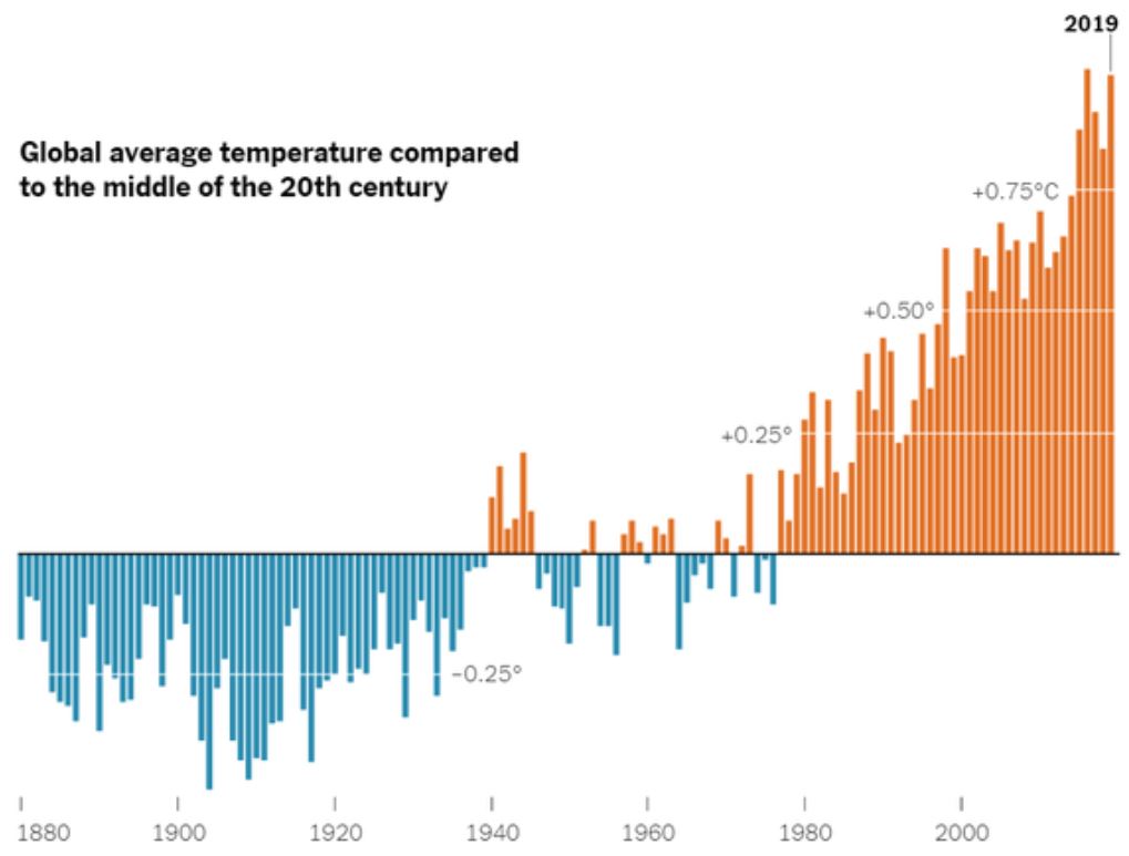
By glancing at this graph one is supposed to "get it"; the main information should in other words pass the "interocular stress test": it should hit you between the eyes. To reach that goal, its creator painted negative and positive fluctuations in world temperature with different colours, such that an imbalance would be even more evident. Bars represent the temperature variation from that of the "middle of the 20th century", as stated in the legend. The extent of the variation is shown by their length, with 0.25 degree intervals (I assume Celsius, with some doubt) shown by the horizontal white lines.
In the above figure I can recognize sources of confusion not only in the units (Celsius? Fahrenheit?), but also in the real meaning of the y axis (deviations from the average of the 20th century or from 1950, or from what? Neither appears likely by looking at the bars). Also, what is the "global average temperature"? I can imagine several possible definitions that would fit such a descriptor. In other words, by being picky one could say that the graph is unfit to be distributed without accompanying text. I made this point in the previous part of this post series, and I will make it again: when you create a data display graph, pay extra attention to include in the legend, or in the title, or in other form within the figure all the information needed to make sense of it: a graph is supposed to live a stand-alone life in this age of social media-dominated information exchange!!
We could consider tons of other kinds of histograms (sorry, bar charts) or similar devices here, but I'd rather conclude here this second part of my discussion of graphs here, facilitating its use with an executive summary:
- When you see a graph, try to ask yourself questions such as "what is it meant to communicate?", "what is the getaway point?", "is there anything special going on with how the data are reported?", etcetera. They will help collect all the information.
- Pay attention to the units on the displayed variables!
- Can something be misunderstood about the reported data? Answering this question will bring you closer to fully appreciate the information content provided by the graph.
Tommaso Dorigo (see his personal web page here) is an experimental particle physicist who works for the INFN and the University of Padova, and collaborates with the CMS experiment at the CERN LHC. He coordinates the MODE Collaboration, a group of physicists and computer scientists from eight institutions in Europe and the US who aim to enable end-to-end optimization of detector design with differentiable programming. Dorigo is an editor of the journals Reviews in Physics and Physics Open. In 2016 Dorigo published the book "Anomaly! Collider Physics and the Quest for New Phenomena at Fermilab", an insider view of the sociology of big particle physics experiments. You can get a copy of the book on Amazon, or contact him to get a free pdf copy if you have limited financial means.


Comments