

There was a tall guy who everybody called Avi, well-dressed and with some undetermined accent (he sounded a bit like Yogi the bear) sitting at the big oval table in the center of the conference room (the 12th floor of the Hirise). I would get to know him very well in the course of my adventure in the CDF collaboration, but back then he was a total stranger to me. He seemed to be capable of giving trouble to all the speakers with his pointed questions and criticism, and the graduate student was no exception.
Avi pointed to a histogram which showed a bulk of bins with large contents where the top mass was expected to sit: they drew the contour of a nice Gaussian distribution; and yet around the Gaussian there were several bins with few entries, lying around all over the horizontal axis. Those entries should not have been there, apparently, since he said "What's that chickenshit scattered around there ?". He made me chuckle. Those few-entries bins did seem like crap on an otherwise tidy picture.
Those were the years of PAW (physics analysis workstation), which was already a quite powerful tool for data analysis and display; yet many physicists still used HBOOK, which displayed histograms and scatterplots as pathetic ascii-art constructs. PAW was powerful, but it takes time to teach new tricks to a physicist, and back then the plotting habits of many colleagues were still pretty basic. The graphical routines needed to display busy scatterplots took forever on the scarce CPU available back then, and this of course did not help the transition.
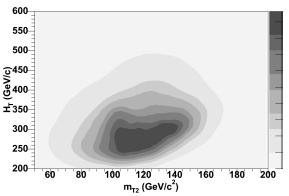 Because of that, plots like the one on the left started to appear only much later, despite the functionality of "contour plots" had been there from the late eighties. When I see something like this, I can't help thinking "Who peed on that canvas" ?, remembering Avi's 1992 remark.
 But time changes everything. ROOT has taken over the job of data display and analysis, and after five years spent struggling to bring things back to the PAW data format, I have finally yielded to the niceties of ROOT. But with the added visualization tools have come also new levels of involuntary humor. Take the plot below.
 This is part of the documentation released as support of the most precise top quark measurement now on the market -one recently produced by the CDF collaboration, based on 4.8 inverse femtobarns of proton-antiproton collisions. The measurement yields by itself a 0.9% uncertainty on the top quark mass, a wonderful result (incidentally: the top quark mass is measured by this analysis alone at Mt = 172.1+-1.5 GeV). Now, this is supposed to be a ThreeD plot of the probability density of the measurement of two top-decay systems (x and z axis) and the hadronic W decay (the y axis, rolling off toward the left). Now forgive me for being obnoxious, but what on earth can this be called other than a TurD plot ?


Comments