Today I will talk about period and phase, estimated using the same source code I previously used. The data I'll be showing is also available on GitHub.
To be clear about the terminology I'm using, I will define a sinusoidal signal as follows:

If the period is 0.88 days, a phase of 0 is the same as a phase equal to any multiple of 0.88. Keep that in mind when interpreting a phase graph: The Y axis should be thought of as circular.
The following are graphs of phase, calculated assuming a fixed period (0.879, 0.88 and 0.881 days respectively), using a 1000-observation window (~24 days) for each data point, in steps of 21 observations (half a day increments.)
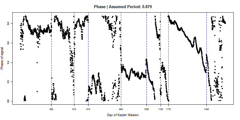
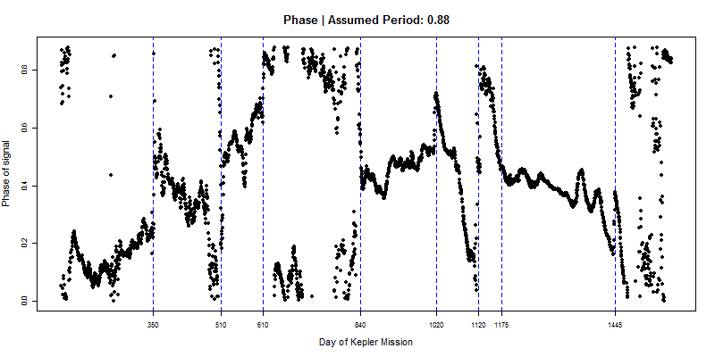
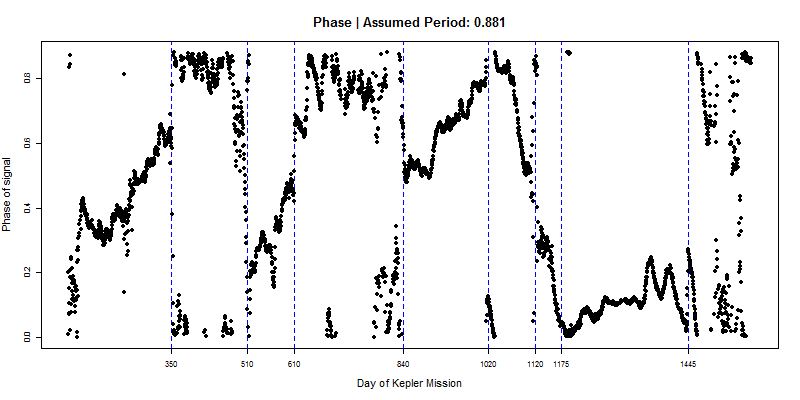


The dashed blue lines are visually-determined best guesses of where change points seem to be. Here is the amplitude series for comparison:
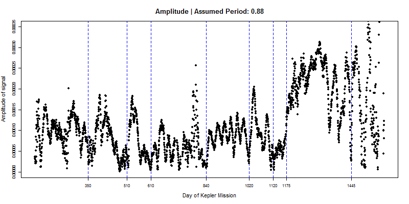

You can get a sense of period from the 3 phase graphs above. If our assumed period is accurate, a phase curve should be flat. If the phase has an upward/downward trend, it means cycles are more compressed/expanded than we thought they should be, so the period is actually less/greater than we assumed.
We can use the segments of apparent period stability to estimate period and phase. I ran a recursive search for maximum amplitude between periods of 0.86 and 0.90 in each segment. For these estimates I excluded any normalized flux observations below 0.995 in order to avoid distortion of the results by the presence of big dips.
| Segment | From Day | To Day | Period | Phase |
| 1 | 120 | 350 | 0.8789 | 0.6837 |
| 2 | 350 | 510 | 0.8816 | 0.2414 |
| 3 | 510 | 610 | 0.8794 | 0.1502 |
| 4 | 610 | 840 | 0.8814 | 0.1834 |
| 5 | 840 | 1020 | 0.8793 | 0.5581 |
| 6 | 1020 | 1120 | 0.8855 | 0.0247 |
| 7 | 1120 | 1175 | 0.8864 | 0.1308 |
| 8 | 1175 | 1445 | 0.8807 | 0.4752 |
| 9 | 1445 | 1588 | 0.8942 | 0.4390 |
It's non-trivial to determine the error of period estimates from this table, and it would be a worthwhile effort to try to determine that, but I believe these estimates are fairly accurate. They are consistent with what we see in phase graphs, where it's also clear that changes in period are real, as opposed to statistical noise or an artifact of something else.
If the period of the signal does change slightly from time to time, as it evidently does, how can we interpret that in the context of a starspot-produced signal? I believe the only possibilities are: (1) The period of rotation of the star changes, and (2) Starspots have differential velocities relative to the surface of the star, and these change from time to time or from one starspot to the next. It's not clear to me how plausible any of these two possibilities are, and checking other stars for similar phenomena should be the next step.
The table might be a little misleading in terms of changes in phase. For step changes in phase we need to look at phase graphs, not the table. Even if two phases across contiguous segments in the table are very different, it's possible there's phase continuity, because of differences in period. That sort of smooth phase continuity does seem to occur in the transition from segment 7 to segment 8.
There do appear to be transitions without phase continuity. A marked step change in phase is noticeable around day 840, for example. The measured phase between D792 (the second biggest flux dip in the light curve) and day 840 shows substantial volatility, however, perhaps because amplitude is very attenuated or because of other noise. For that reason, it's unclear if there's true discontinuity or another segment we should be considering. If there is a real step change, it could be interpreted as one starspot disappearing and another one appearing elsewhere on the star. It's clear that our segments are separated by sections of attenuated amplitude, which is consistent with starspots going away.
References
Benjamin T. Montet and Joshua D. Simon, 2016. KIC 8462852 Faded Throughout the Kepler Mission. arXiv:1608.01316.


Comments