

Today, in the same context - an analysis meeting where some graphs were being examined - I was reminded of another crucial skill that successful data analysts should possess. My obsessive compulsive behavior then forces me to also touch on that, to be more complete. I decided that the skill in question is called "Extrasensorial Plot Premonition", EPP. I am joking, of course, but by naming it that way we give a bit of flavor to this otherwise dull piece, and maybe increase by x3 the number of views.
To clarify what I mean with EPP I find it useful to consider an example drawn from meteorology rather than particle physics, for no other reason that I already discussed that example some time ago. In Venice, my hometown in Italy, weather conditions sometimes conspire to produce abnormally high water levels. Water floods the calles and squares, giving the place an eerie charm: the Adriatic sea reclaims the land of its Pearl, if only for a few hours. But in the instance I mentioned in the post linked above, the high tide was coupled with another unusual phenomenon - four inches of snow on the ground!
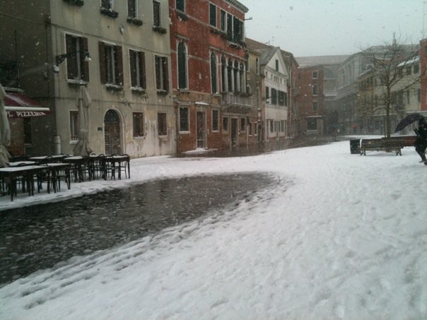
Campo S. Margherita, Venice - covered with snow and water in the morning of 12/19/2009.
Despite the challenge of walking in a few inches to one feet of water, tourists are usually amused, and they use the chance to take selfies and videos of the strange phenomenon. I do not blame them: despite having seen it hundreds of times I am also fascinated by the landscapes it creates. But seeing together a high tide and a significant amount of snow cover is something really, really rare - in fact in 50 years of life in Venice I only witnessed it once. In that old article I estimated that the chance must be of the order of once per century or so.
Now, rather than discussing odds, here I would like to deal with the correlation of different factors that may give rise to this weather oddity. One thing to note is that the highest tides take place when large amounts of rain has recently fallen in the region, because the latter enhances the phenomenon and the water level. Another thing to note is that the Adriatic sea is oriented North-South, and Venice is at its northern tip. An oscillation in the overall sea level toward the north part of the basin is more likely when there is a southern wind blowing. The wind that most often strongly contributes to the highest tides is called "Scirocco", and it is a warm wind.
So, armed with the above considerations, we could conceive a graph where we put on the horizontal axis the snowfall or rainfall in inches, and on the vertical axis the maximum height of the tide. How would such a graph look like? I do not have data to put it together, but my extrasensorial plot premonition helps me construct a view of what it would show.
My reasoning is that for rainfall, there is a mild positive correlation between the maximum level reached by a high tide event and the amount of rain that fell in the previous hours. This is rather obvious given what I mentioned above, but large rainfalls are not common, and neither are very high tides, so the curves of iso-probability have to be centered at the lower-left corner of the graph. I drew them in black in the graph. I also put some dashes to note the highest-recorded high tide, which was recorded on November 4 1966, when most of Venice was under several feet of sea water.
In blue I tried to picture what should instead happen with snow. Snow is much more rare than rain, so the bulk of the data must lie on the left edge of the graph. But there is also an anti-correlation expected, due to the typical scirocco wind raising the temperature of the air during the floods.

In the graph, I implicitly inserted the notion that the 194-cm high tide of 1966 was not as rare an event as the 115-cm + 10-cm snow cover of 2009 - the blue cross lays far away from the blue curves. It cannot be proven, but I believe the combination of a high tide and a significant snowfall must only result from a weird synergy of perturbed weather, under-zero conditions, and scirocco raising the water level and the temperature to 0 degrees. So concealed in the graph, there could be an added positive correlation of very extreme events giving rise to both high tide and snow, but only at the level of a few times per century at most.
Now, to go back to EPP - I cannot prove it in this case of course, but you have at least been able to follow the consideration of different weather effects and their interrelation, and what they could mean for the density of data in the graph. By developing a capability to reason on the relationship of different variables characterizing your data, you can indeed develop some sort of EPP. It is a real superpower in and of itself, as in your analysis work you can first ask yourself how the data would look like if you plotted them in some way, and then produce the graph with the computer. Any difference between your prediction and the graph in your display will be extremely interesting to study, in order to eviscerate all the details and correlations present between the variables (if you are plotting more than one at a time, as in the case above).
In writing about EPP, I am reminded about something Dick Feynman wrote in one of his fantastic books (I think it is "Surely you're joking, Mr. Feynman!"). He reported on his capability of visualizing the mathematical objects considered in theorems (e.g. in topology or similar branches where visualization makes sense), or in complex physical systems. As he read the theorem, he used to picture in his mind an object. Start with a sphere, e.g. (the most featureless object you can conceive, to avoid putting in it features that the theorem does not mention). Then if this object is said to have some property, you can add it, just like a painter adds detail to a portrait. Some hair on the sphere here, a hole there - suddenly, the thesis is enunciated, and you can draw some conclusions on whether the picture in your mind conforms or not to the proposition. It is admittedly weird, and yet it works! Human beings reason by drawing analogies, and this visualization mechanism is perfect to help scientific reasoning.
I believe a physics student who wants to develop his or her skills in data analysis should entertain with developing an EPP, in addition to the other superpower I mentioned in the previous post, sceptical thinking.


Comments